A Quantitative History of Human Scale Neighborhoods in America
Can housing markets provide a peek into how people value urban design? My masters thesis at UC Berkeley takes a quantitative look at the relationships between urban design and property values in 38,000 neighborhoods in 50 US cities. Its findings indicate that moderately dense, fine grain neighborhoods with a mixture of uses have risen in value far more rapidly than their less human scale counterparts. The map above provides a peak into the history of those desirable neighborhoods – a typology that has become increasingly rare as its value rises.
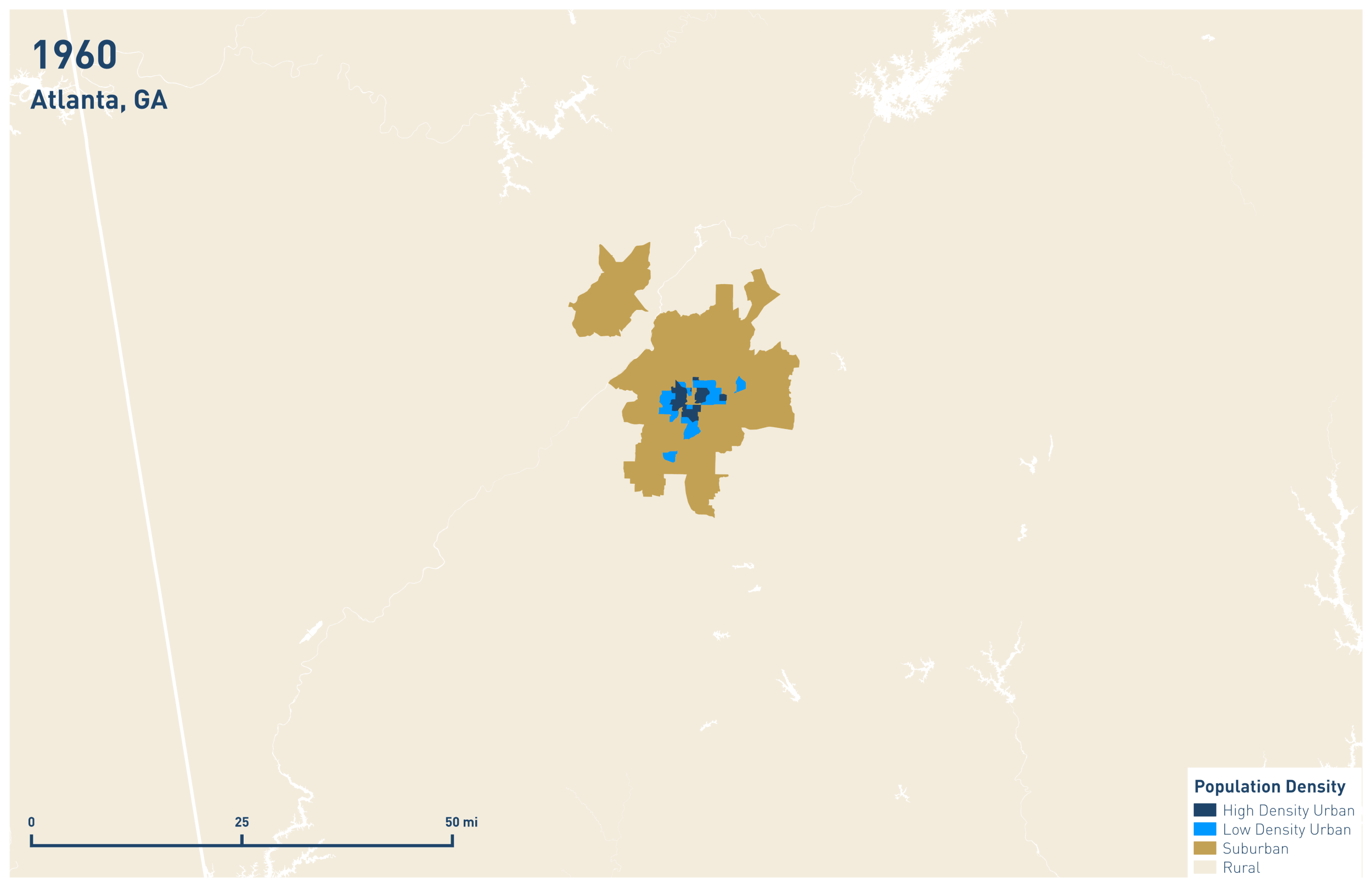
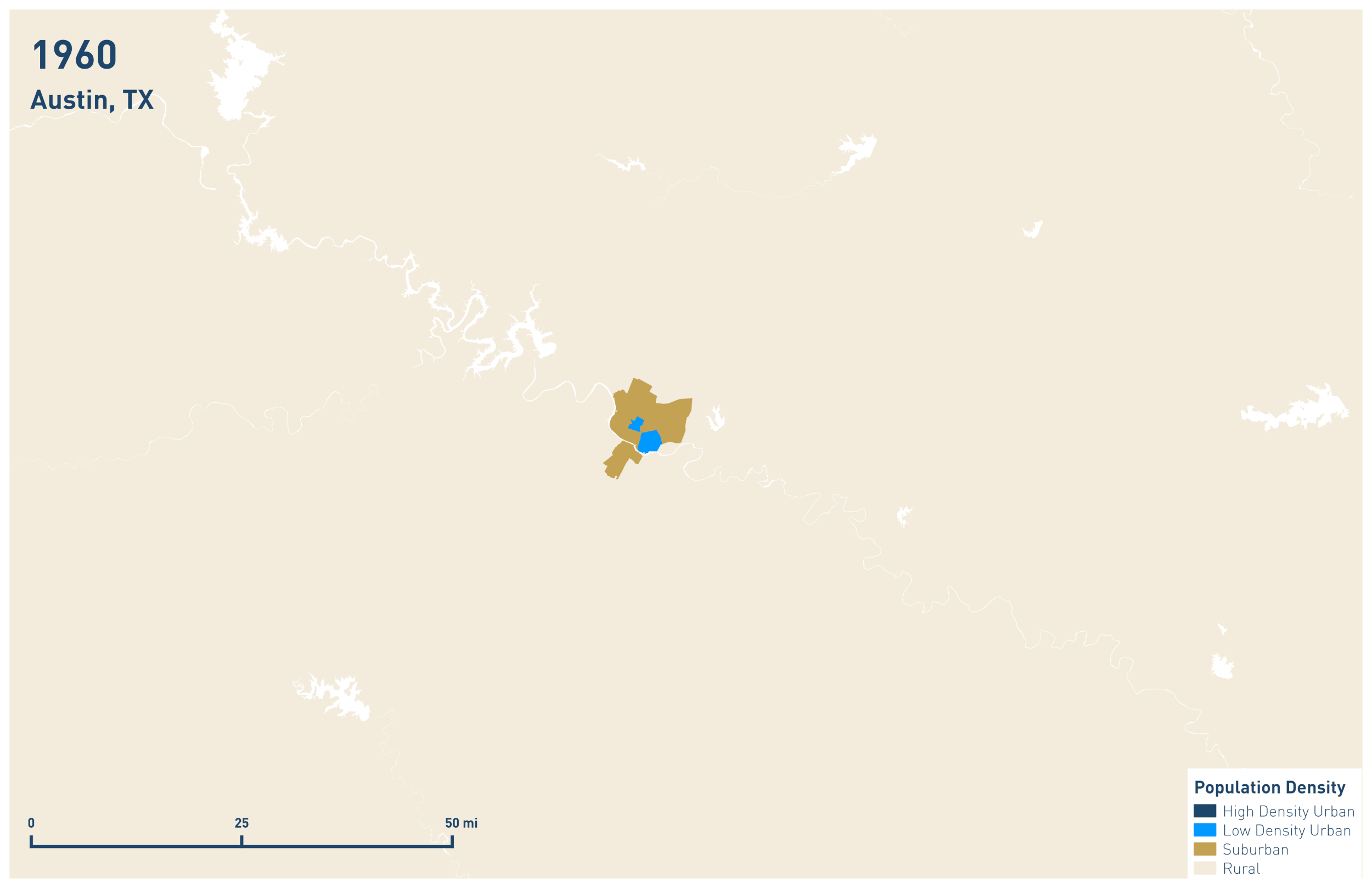
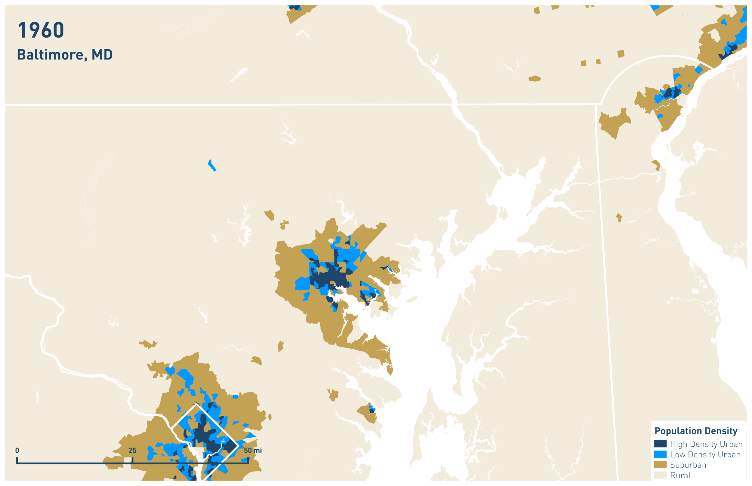

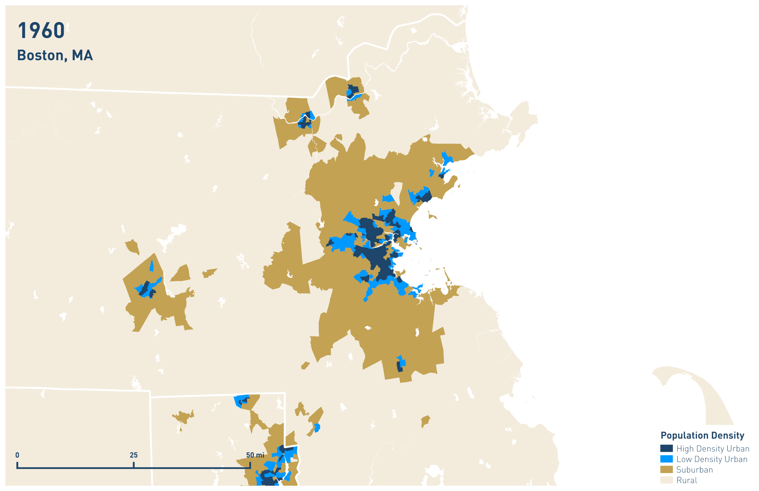
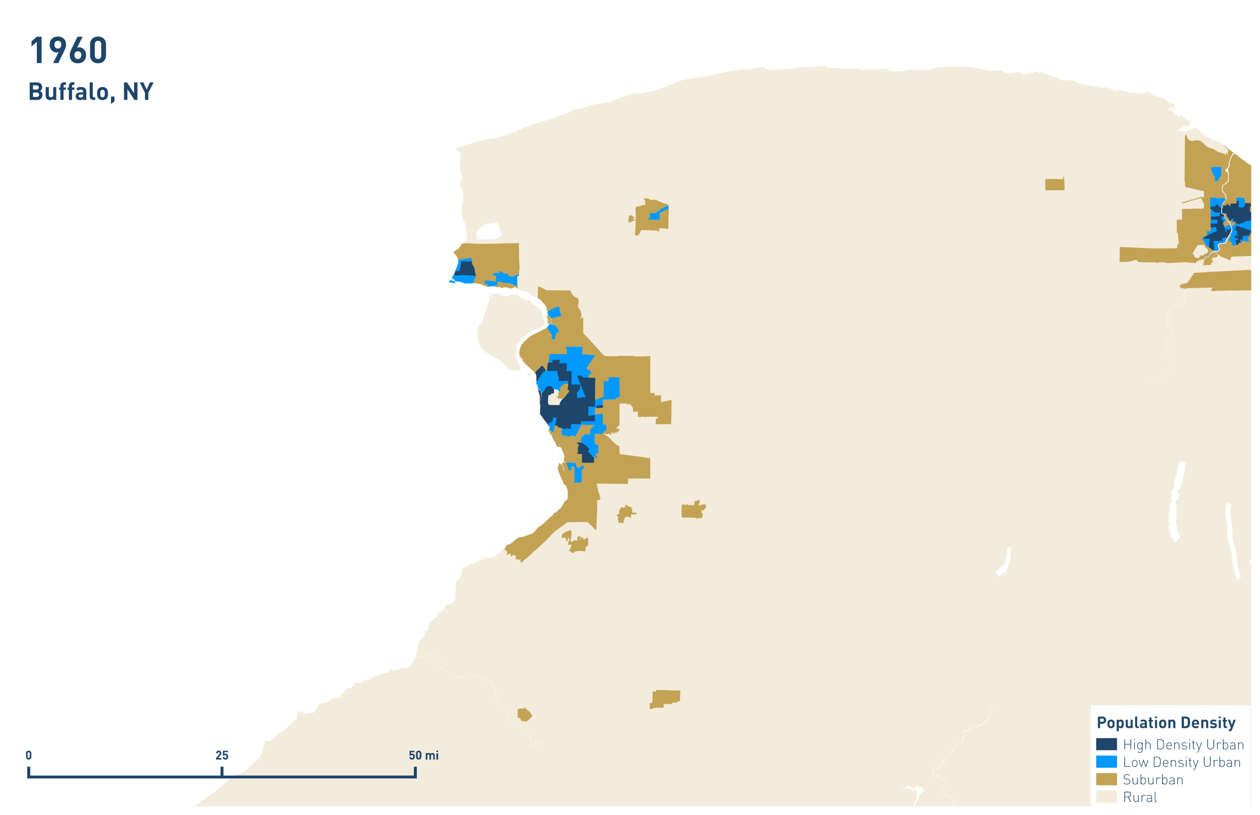
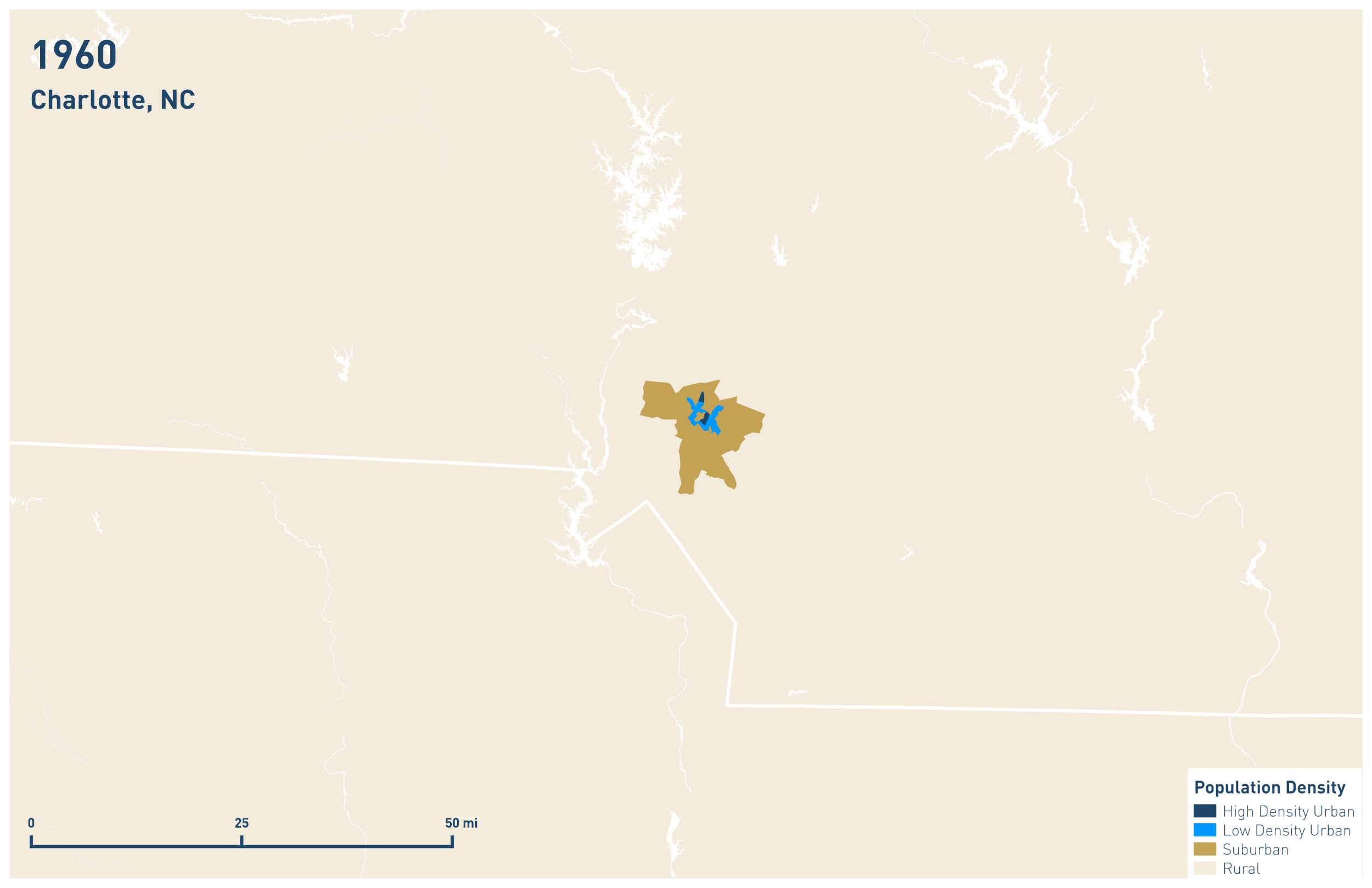
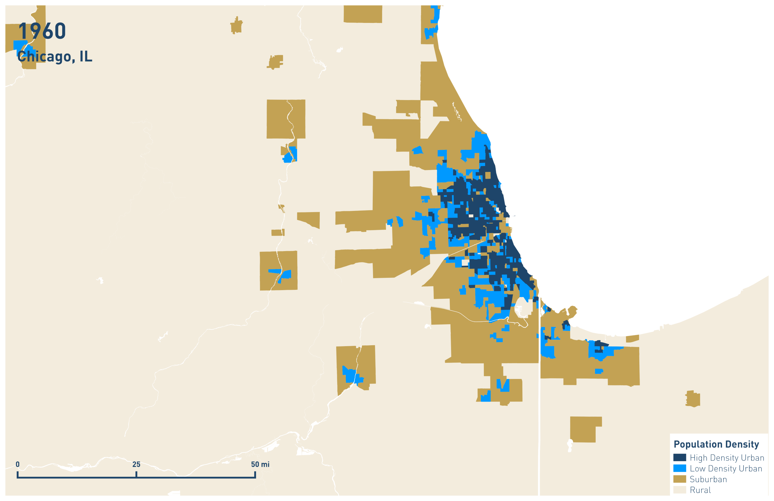
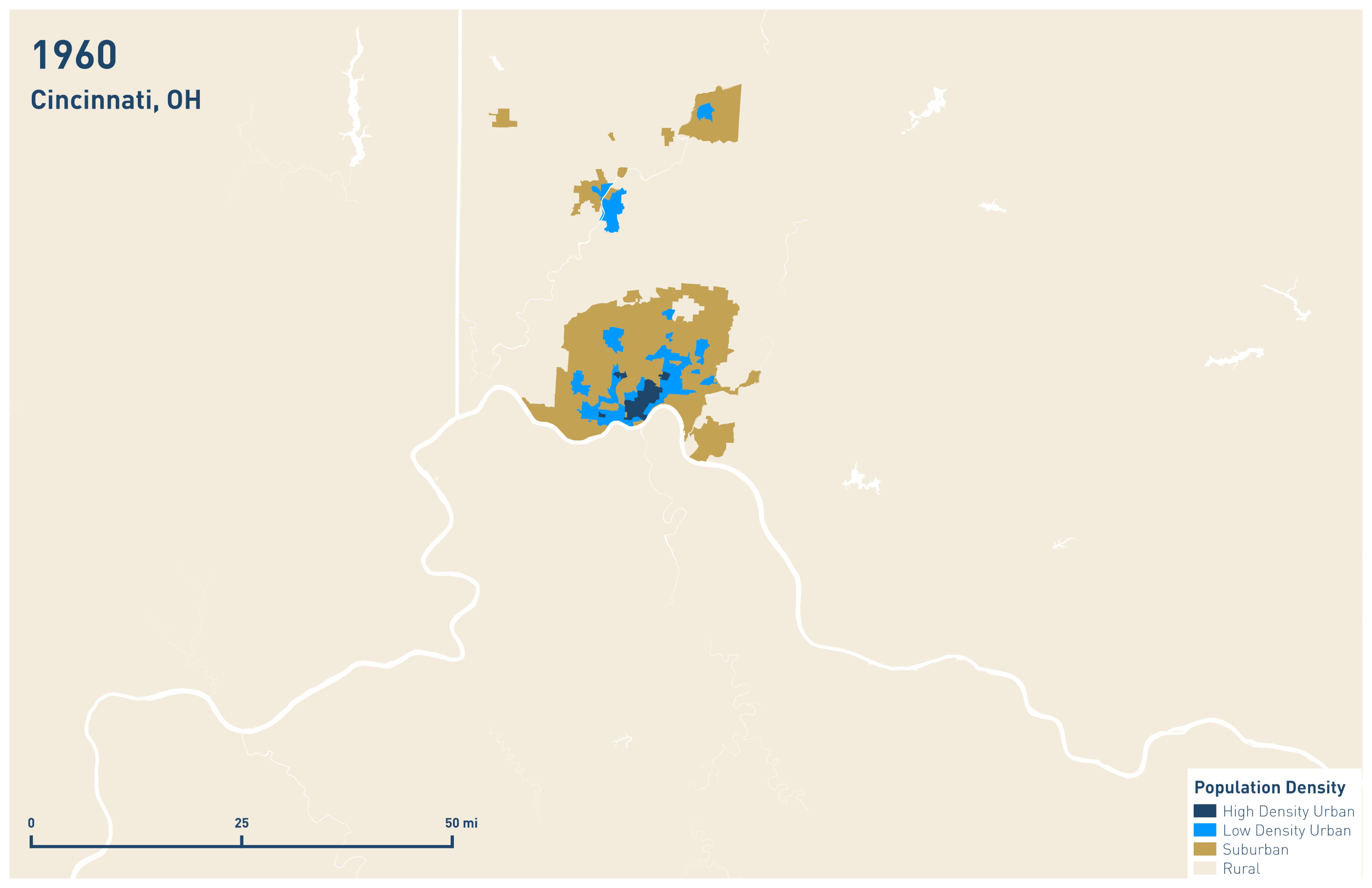
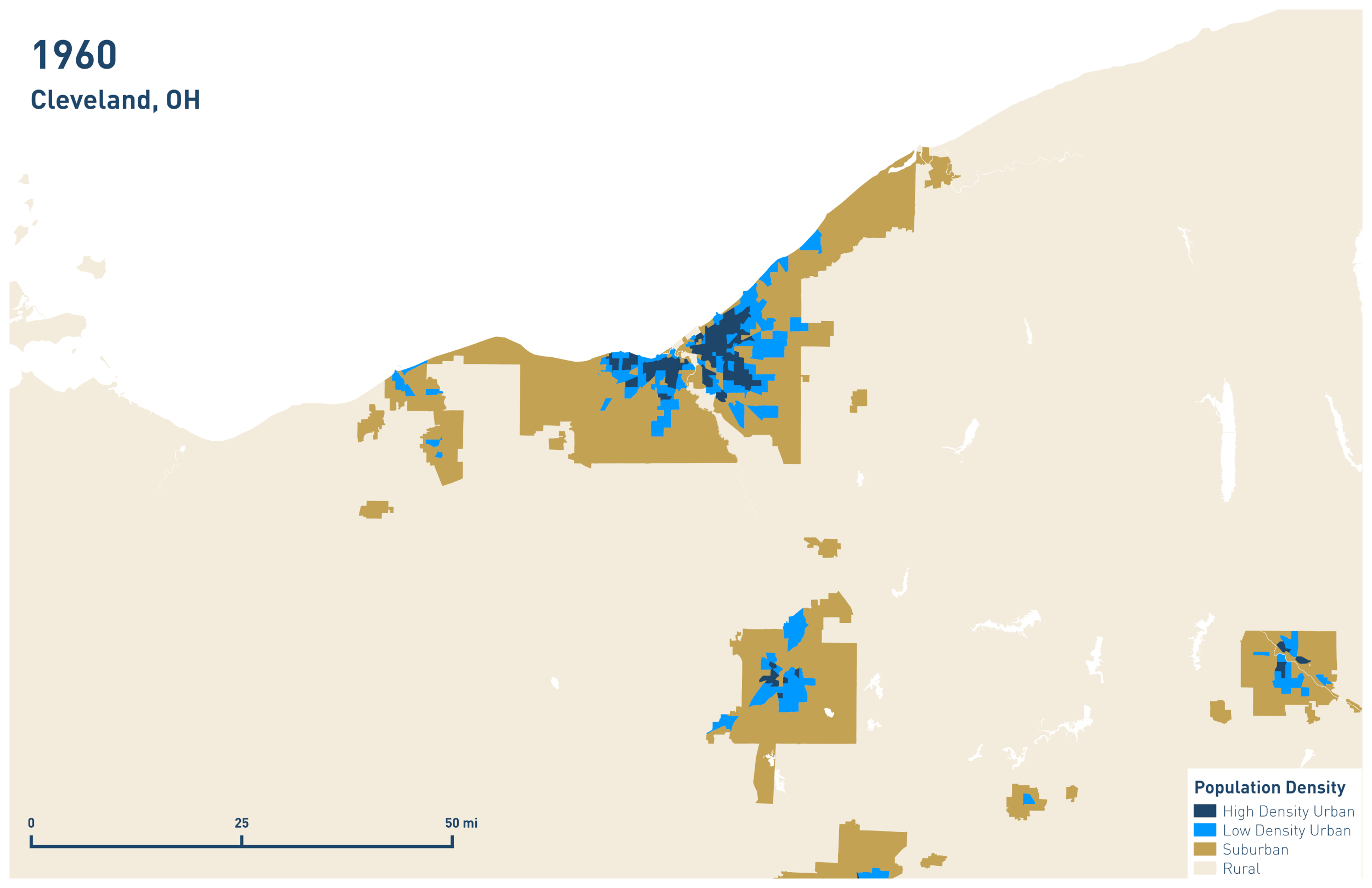
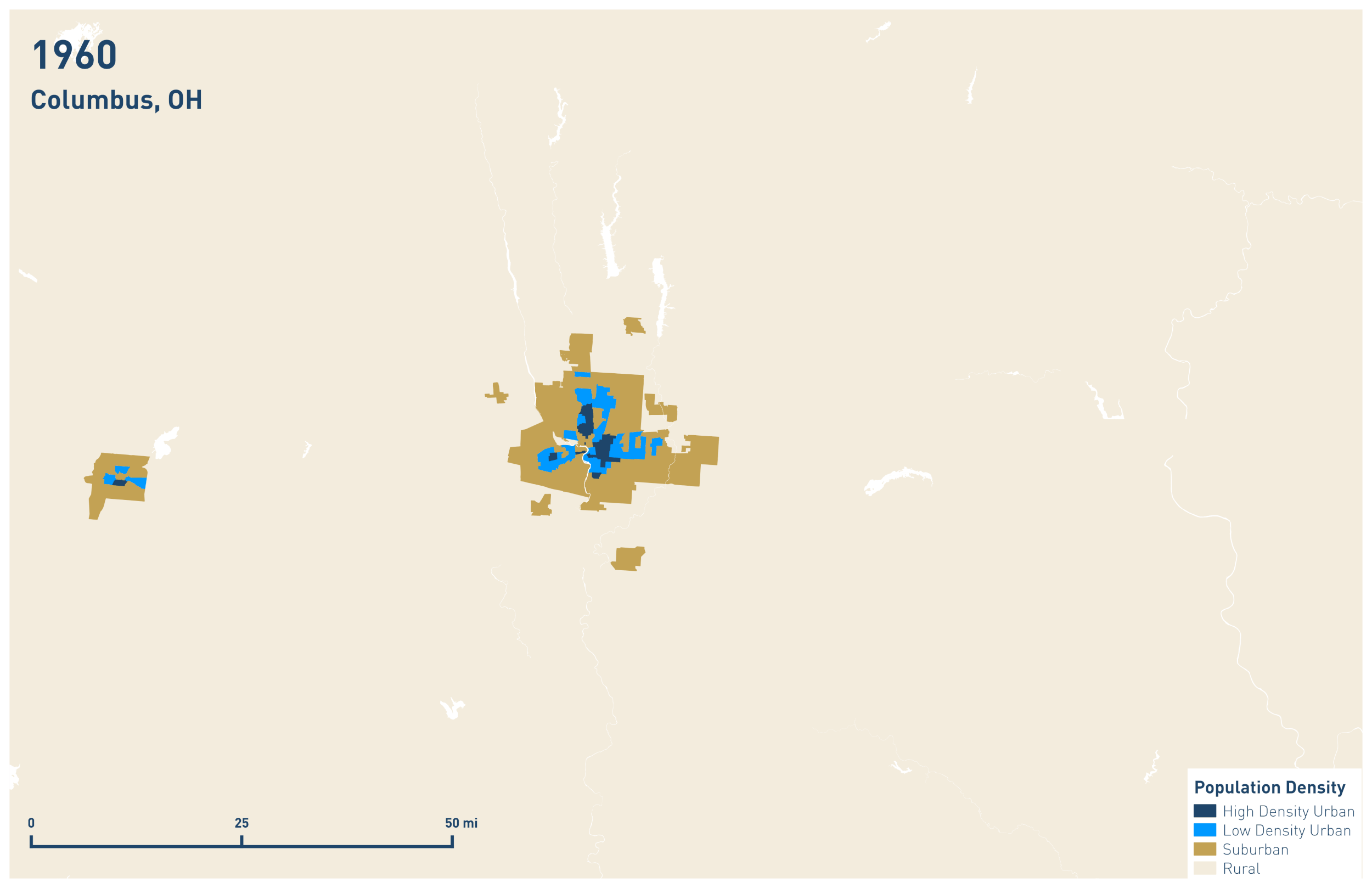
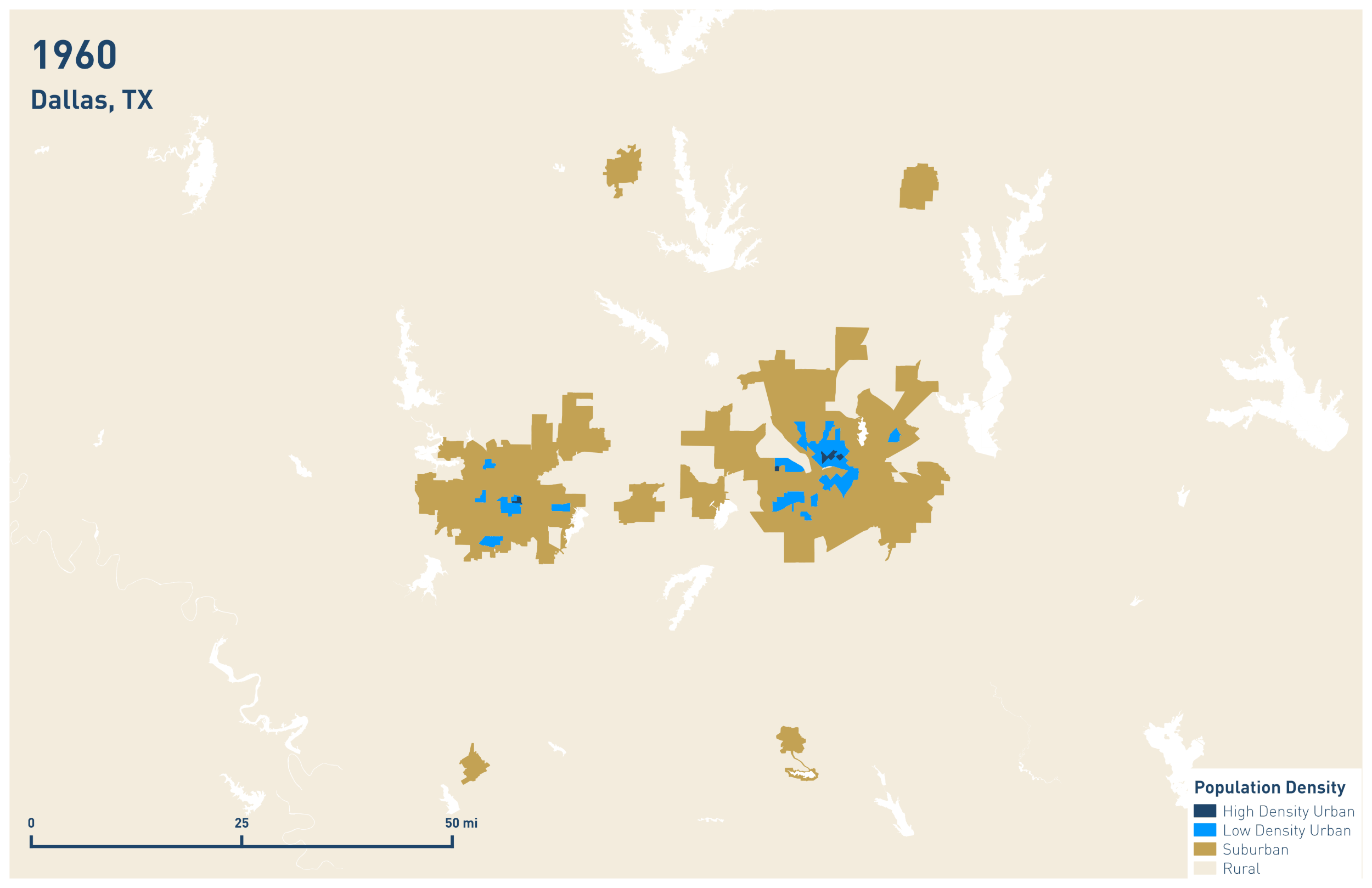
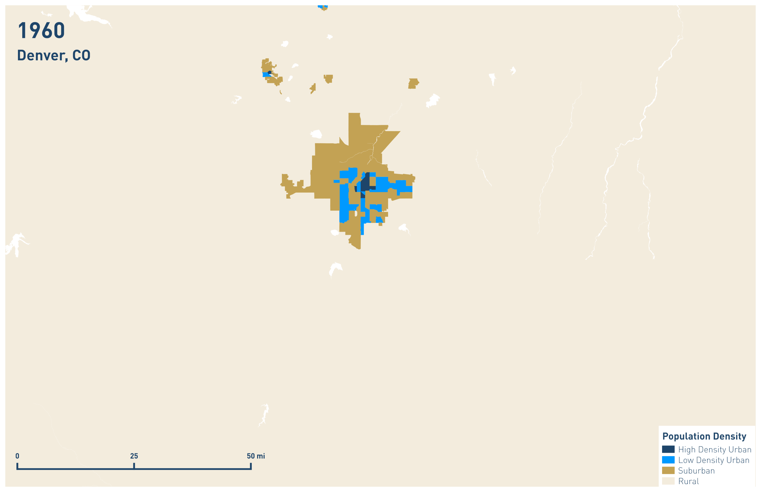
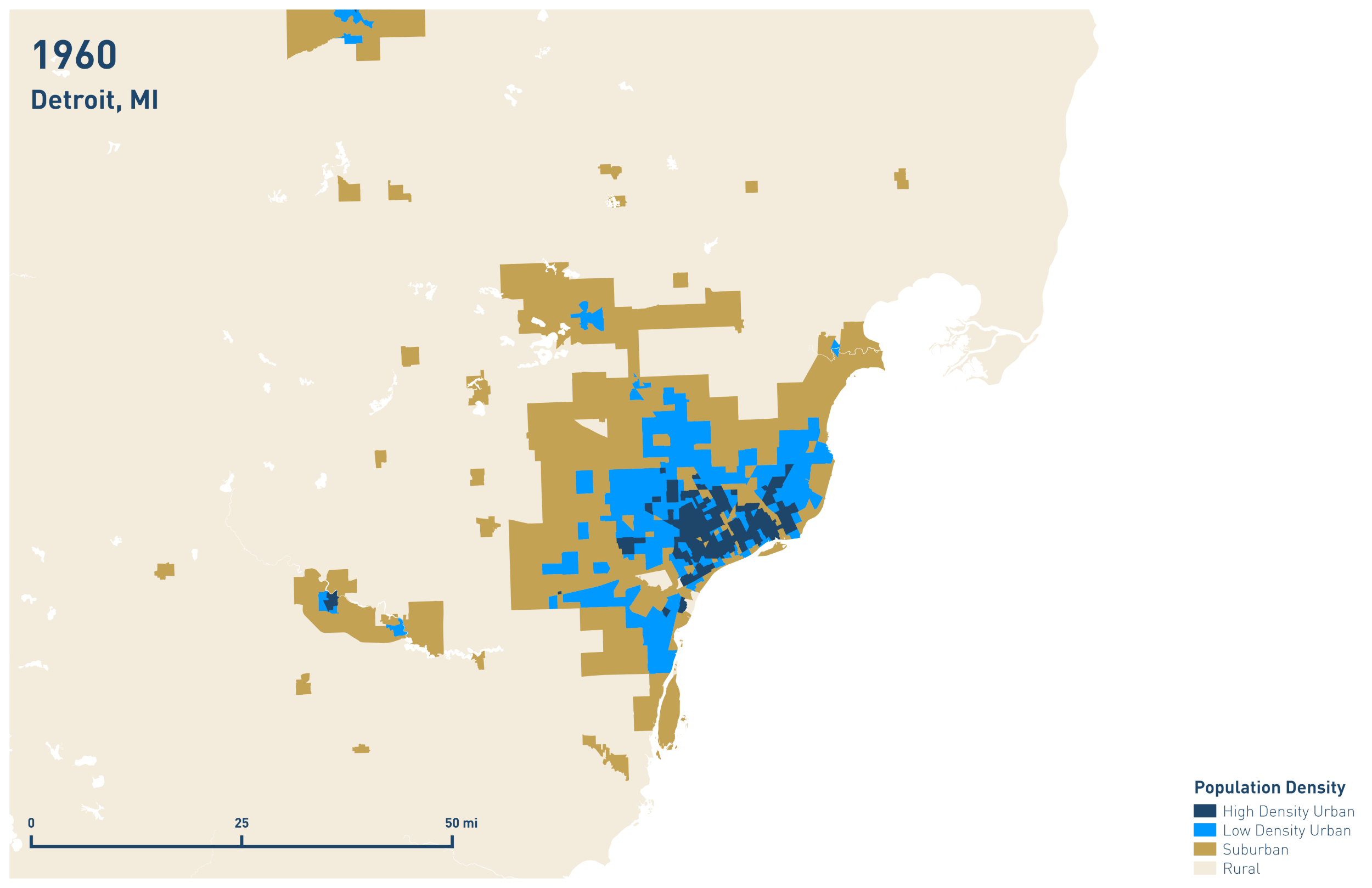
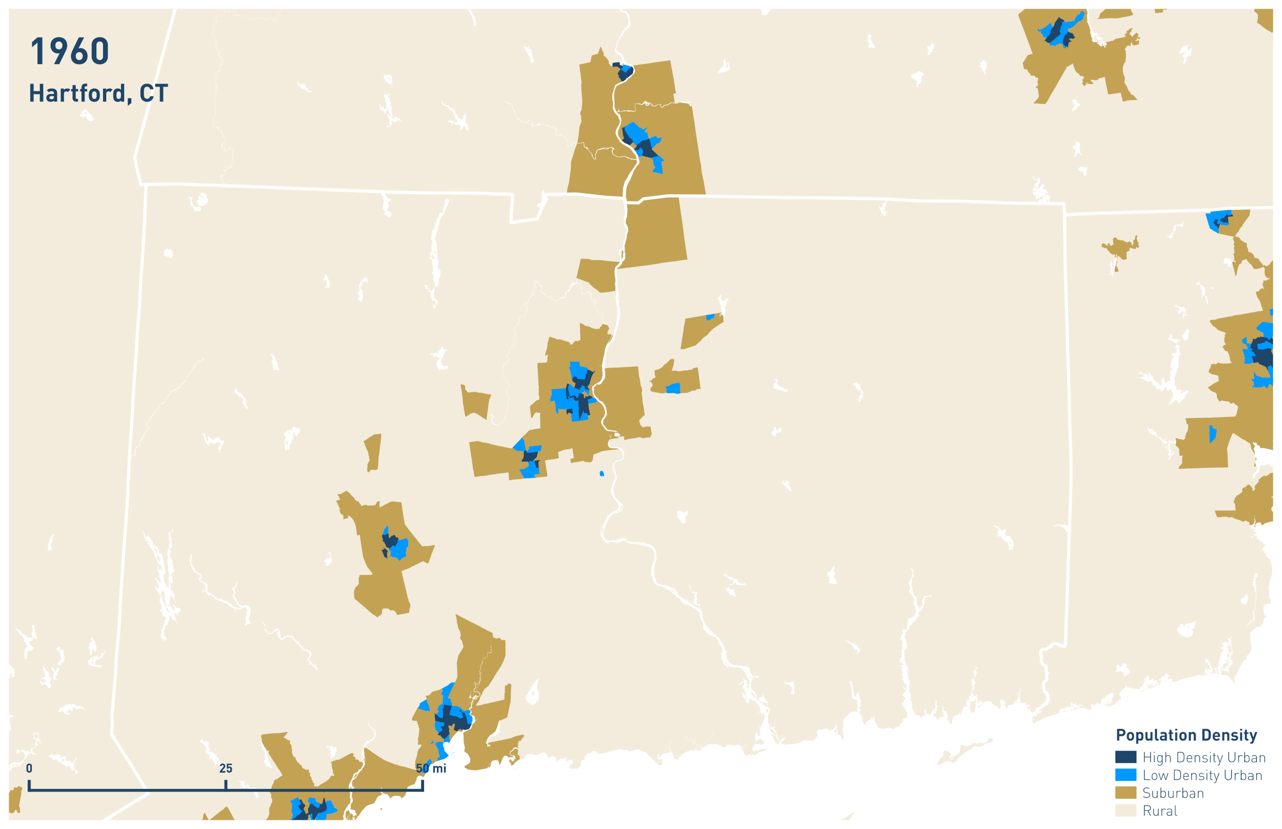
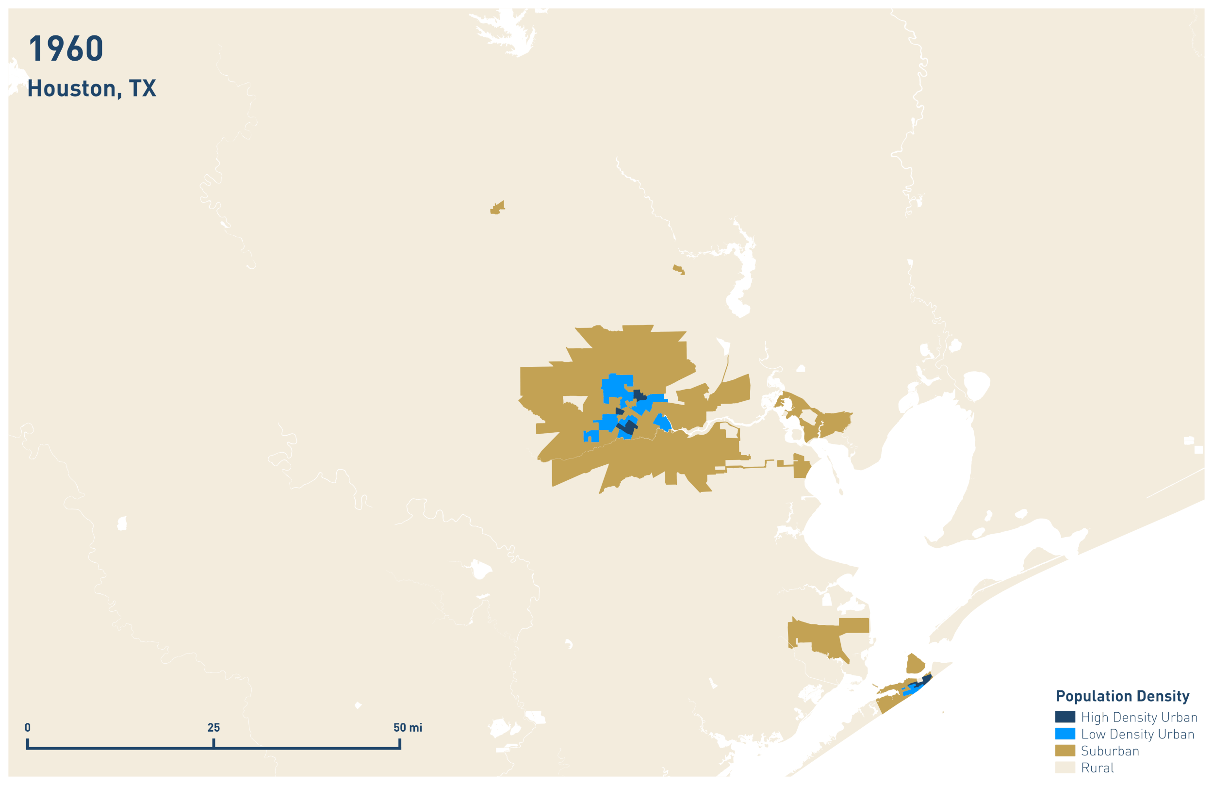
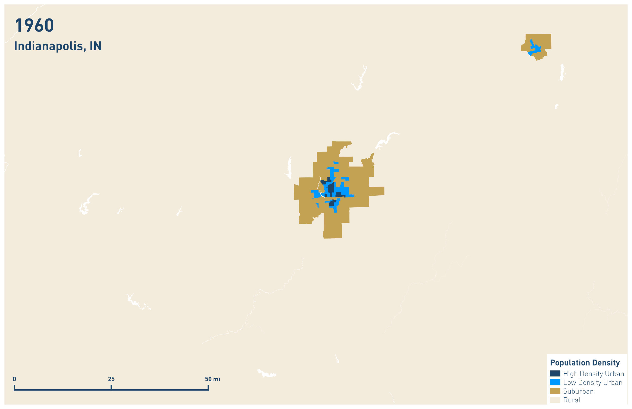
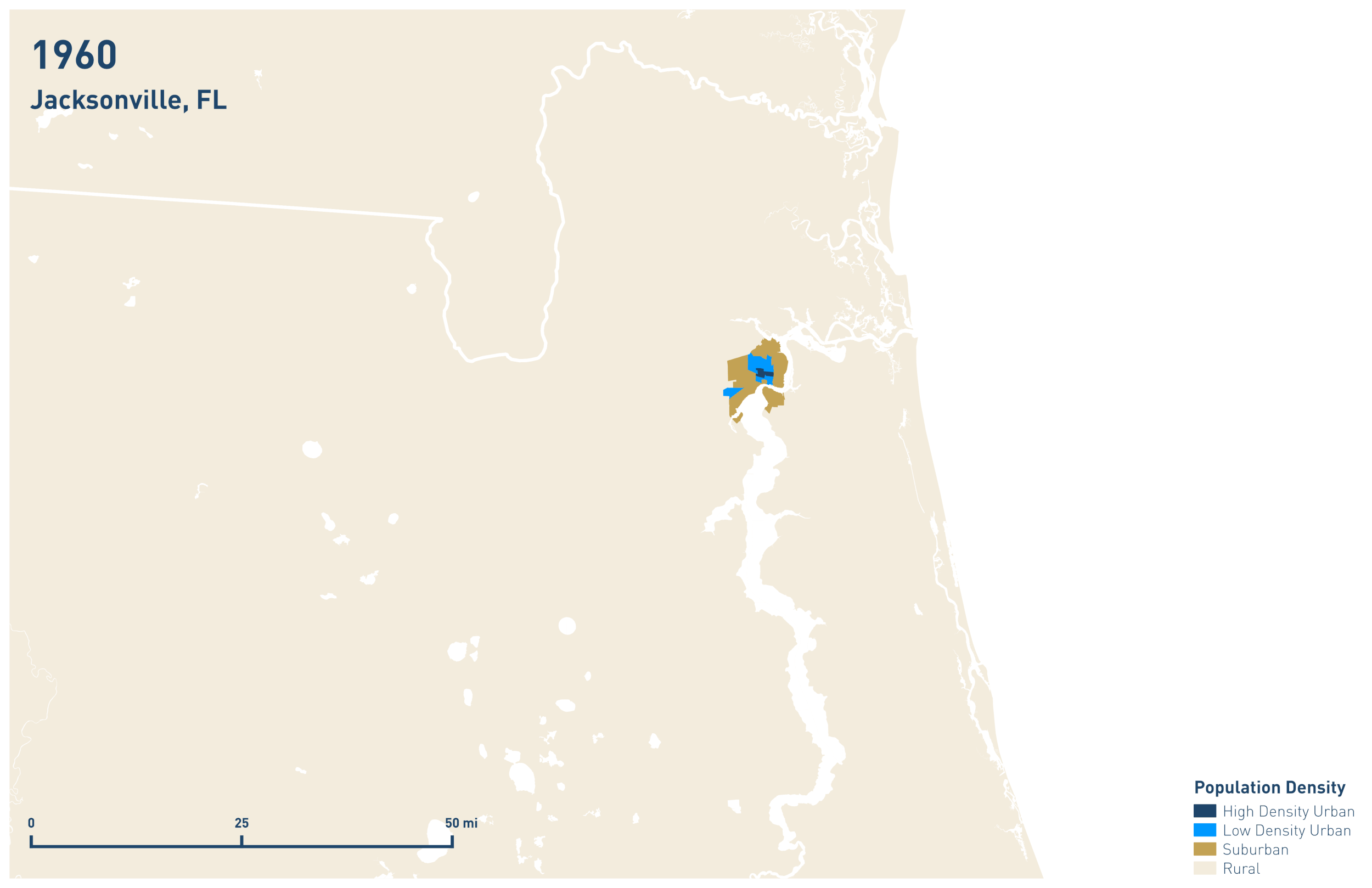
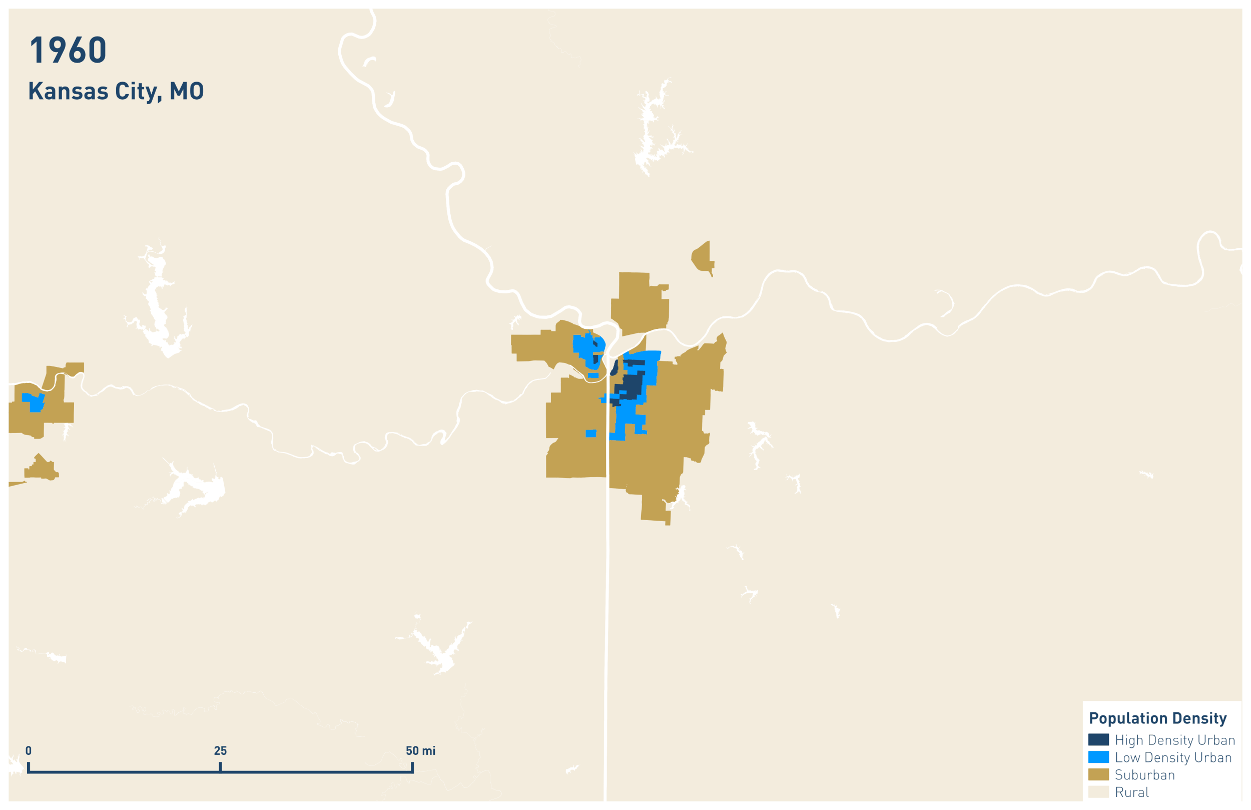
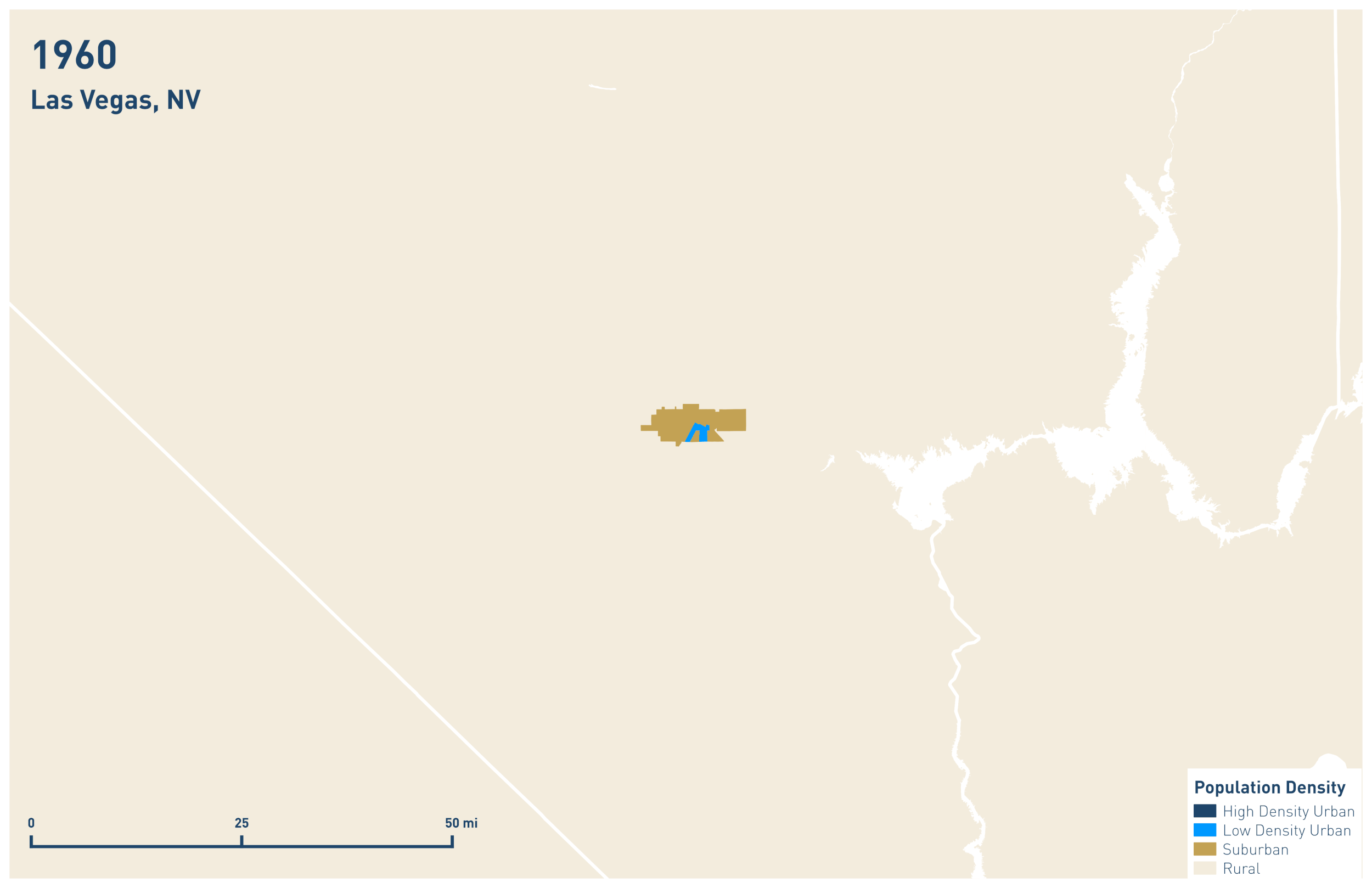
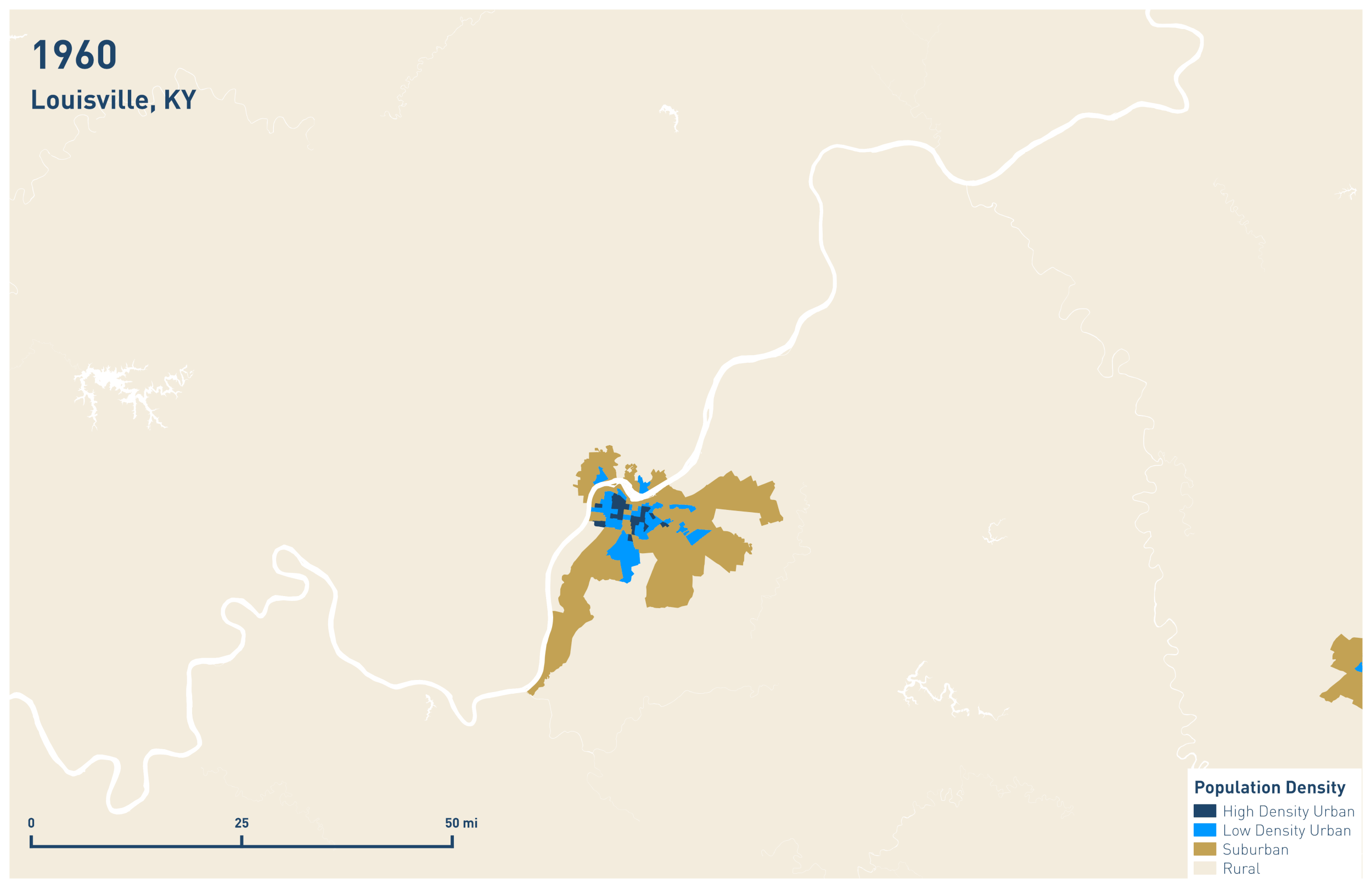
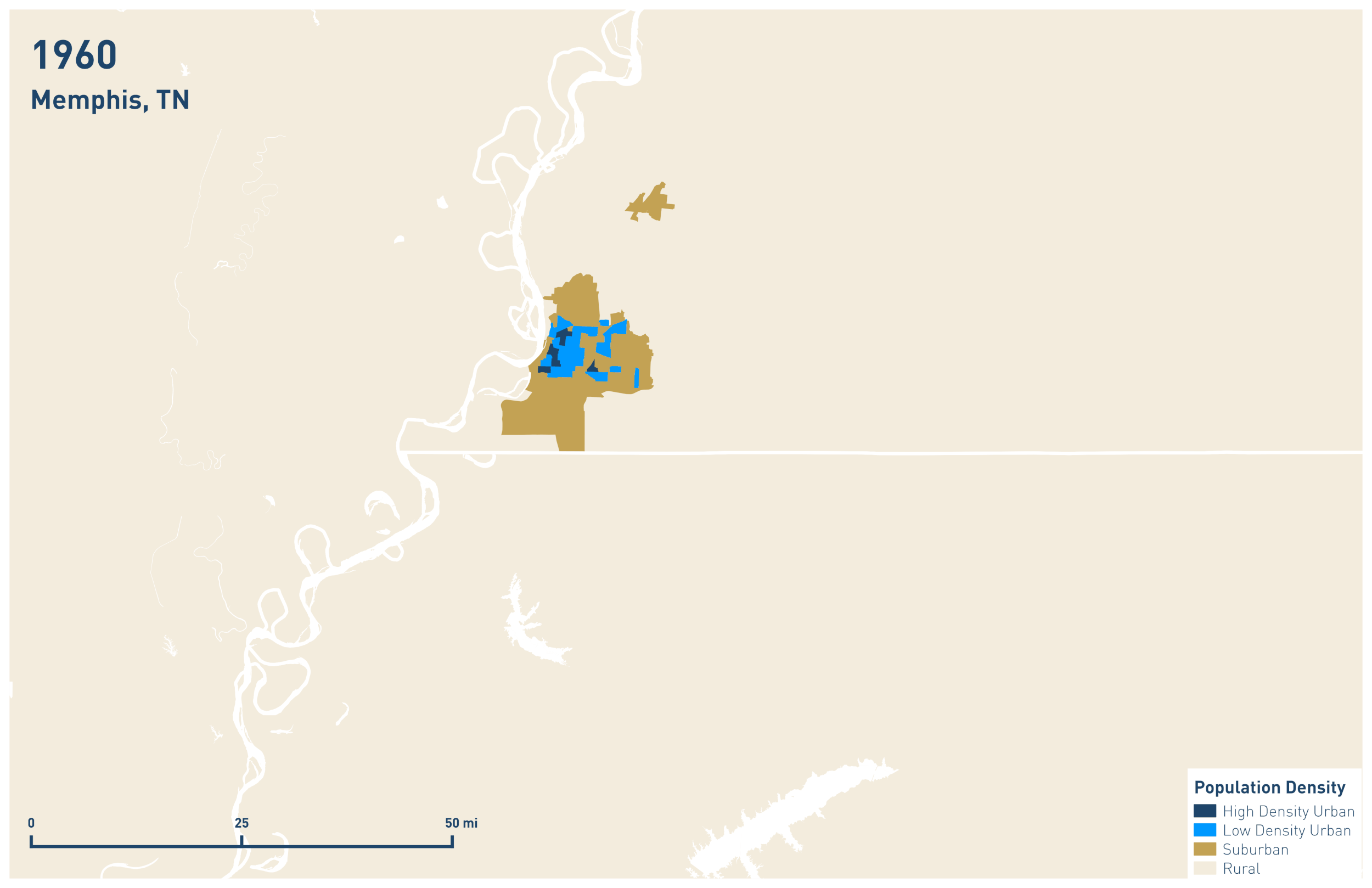
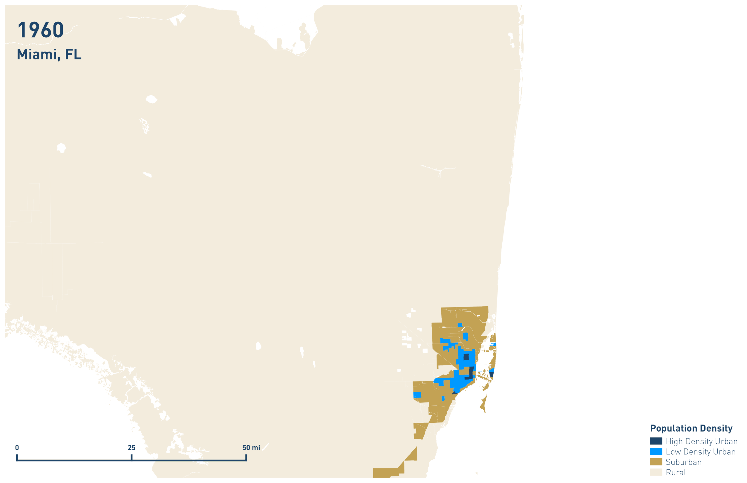
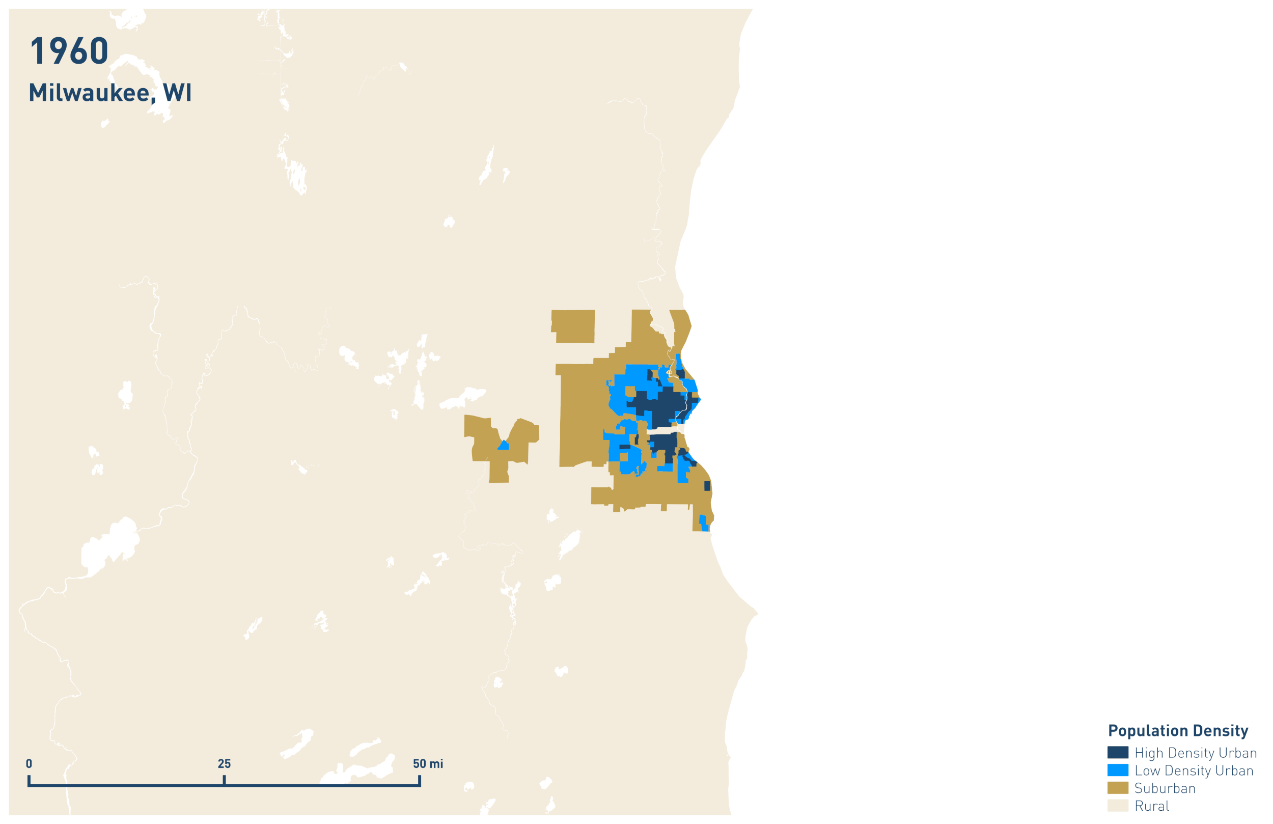
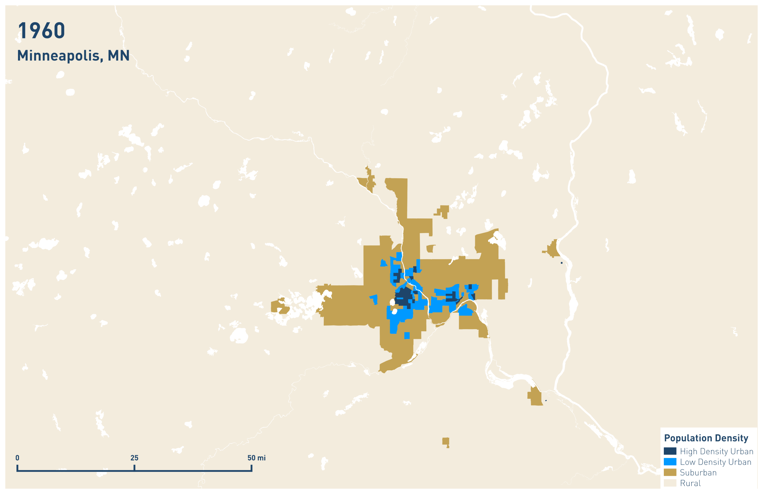
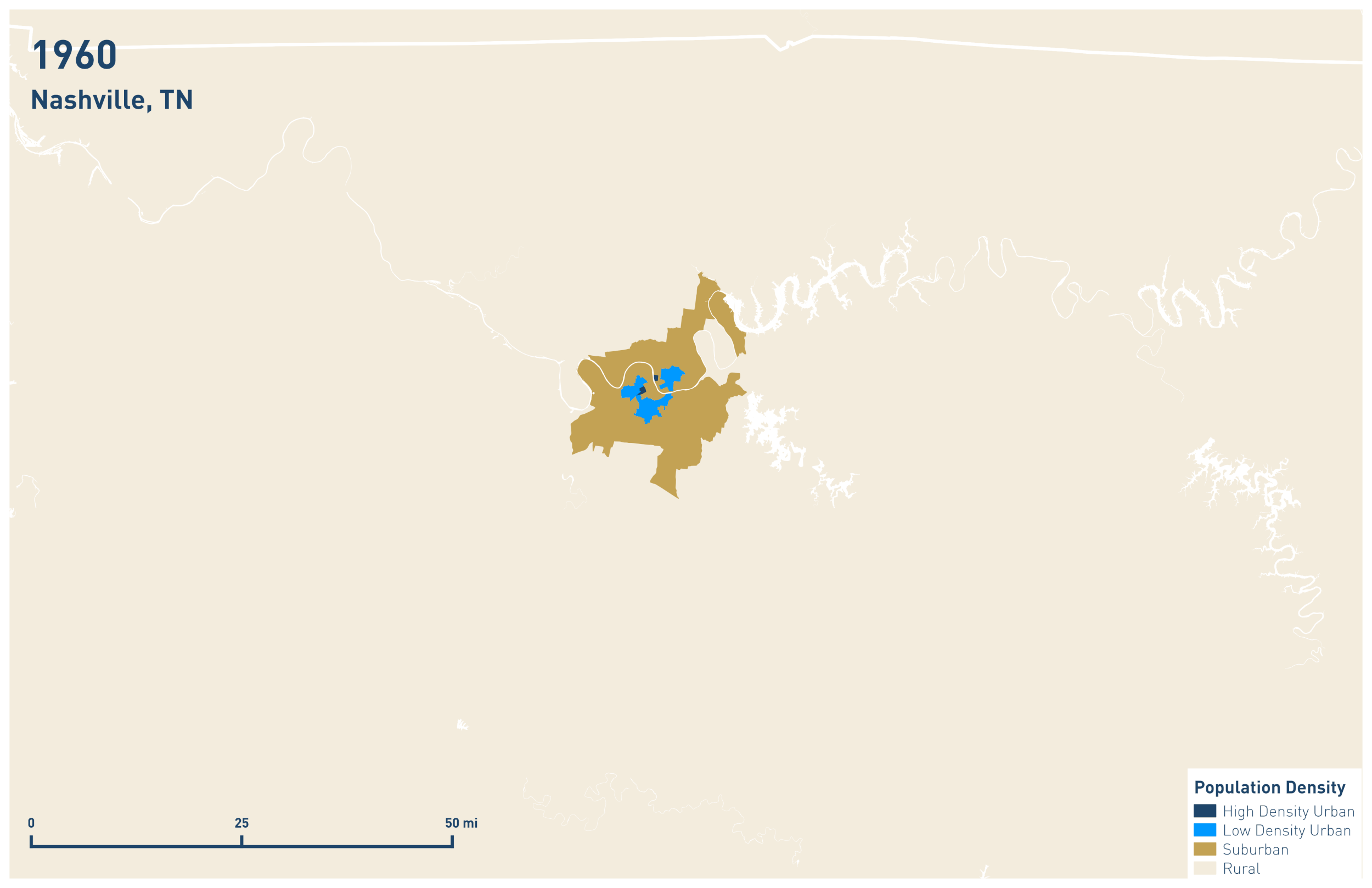
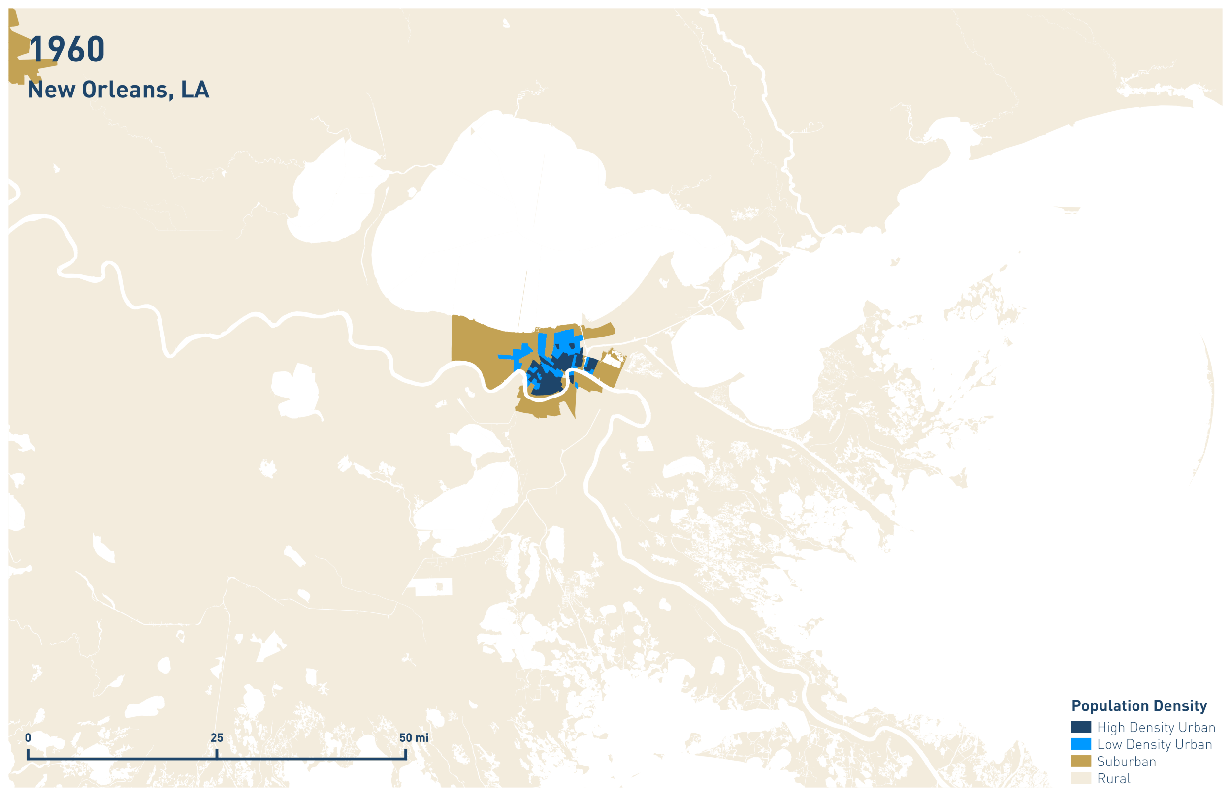
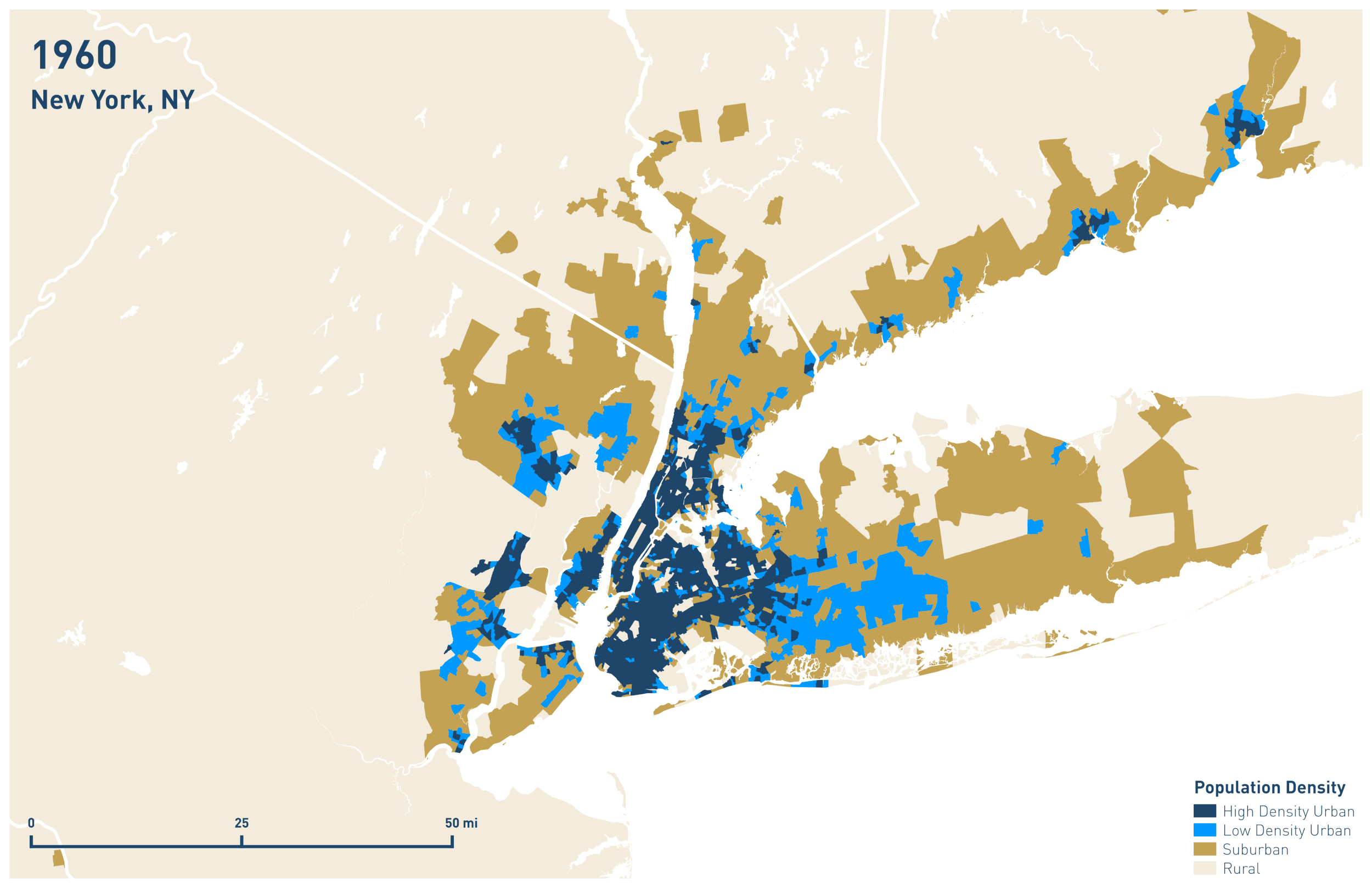
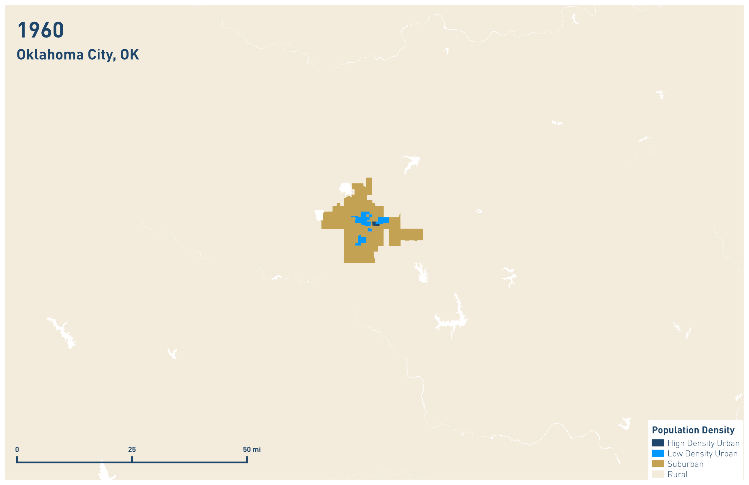
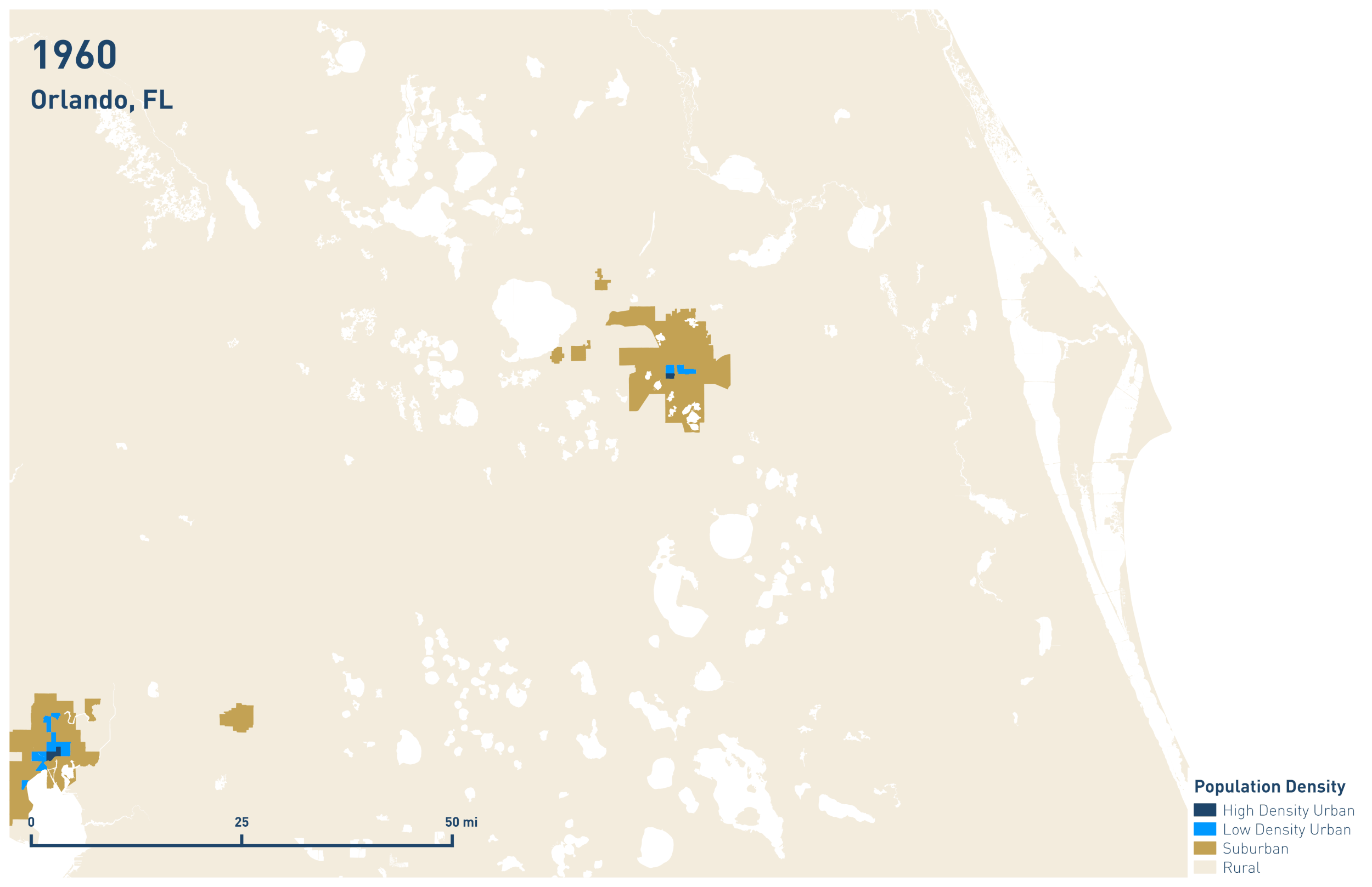
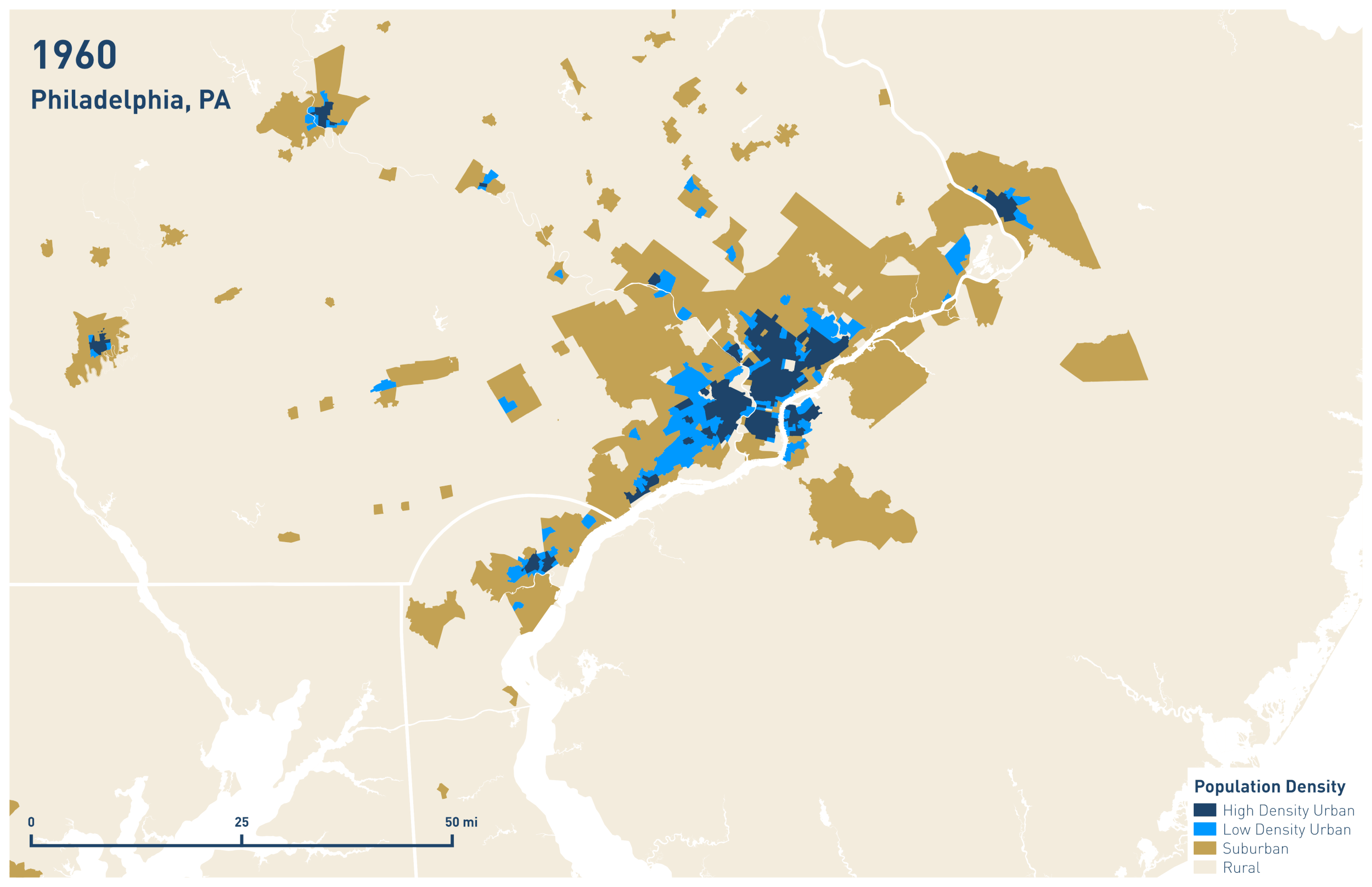
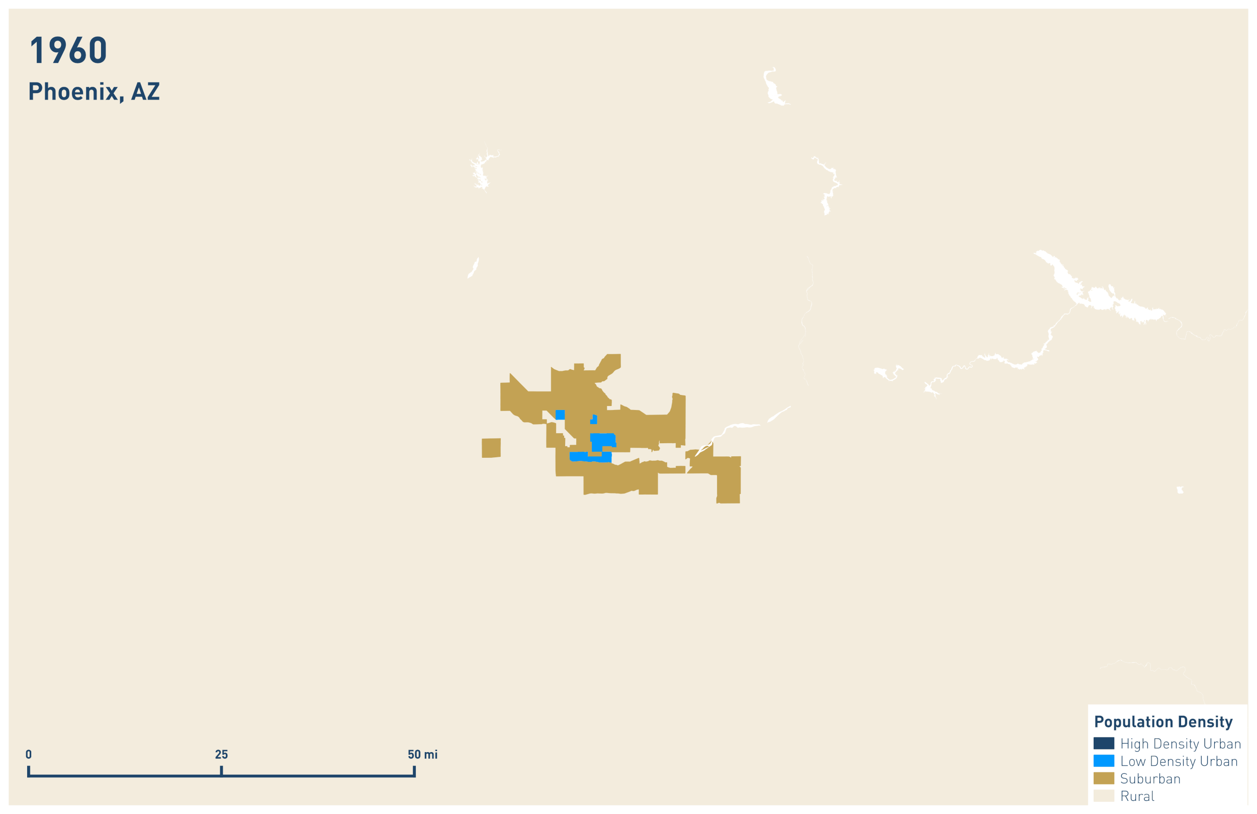
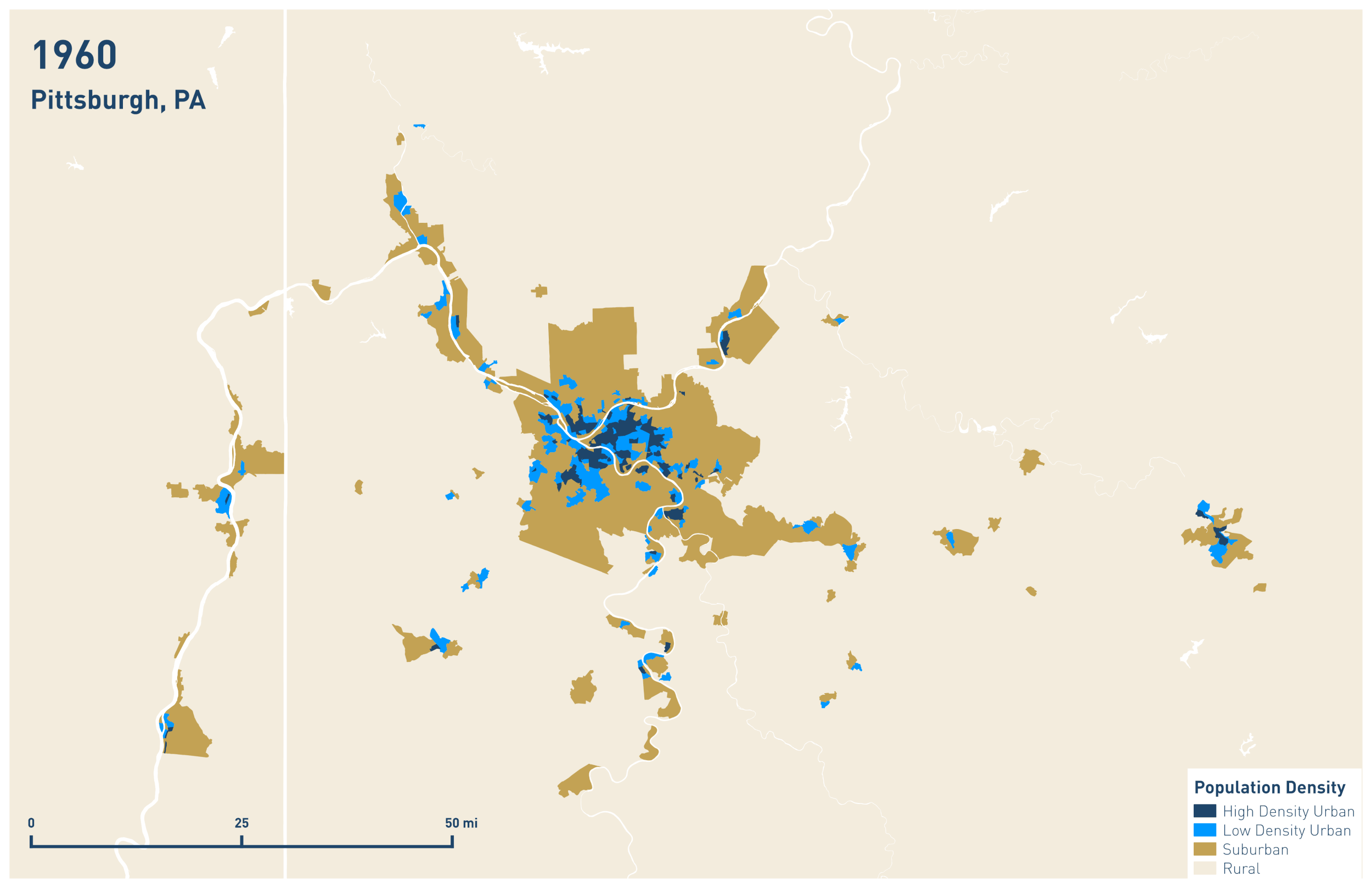
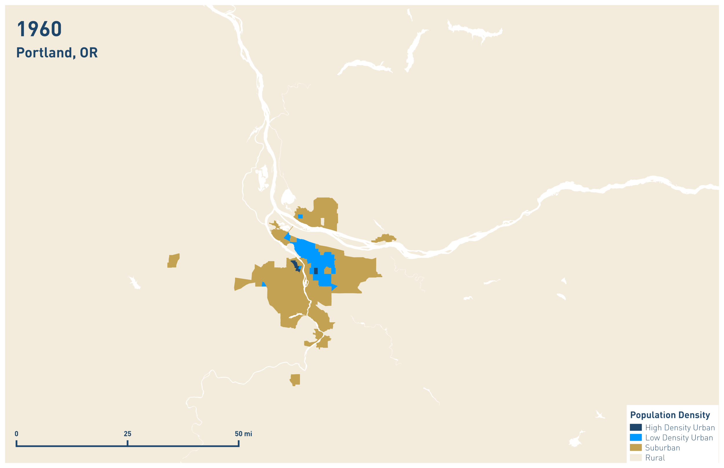
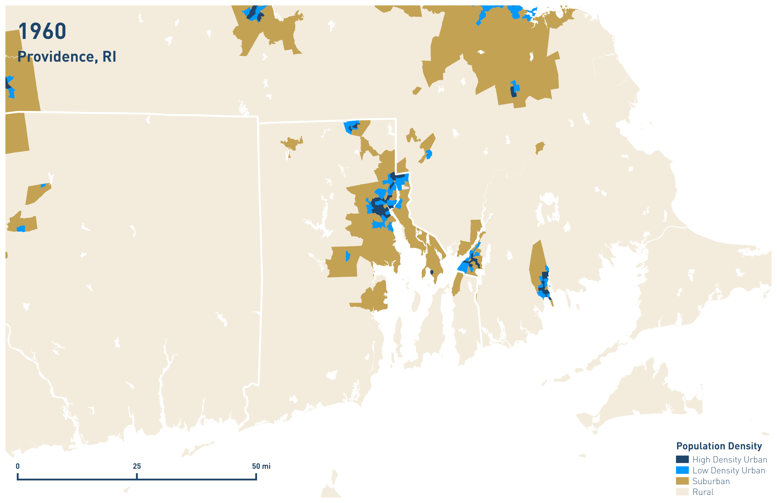
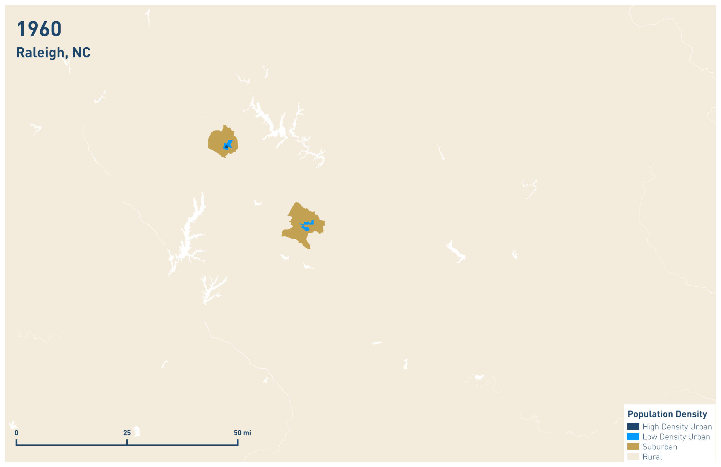
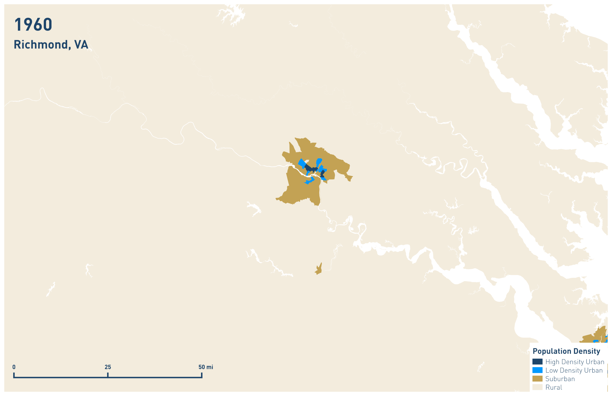
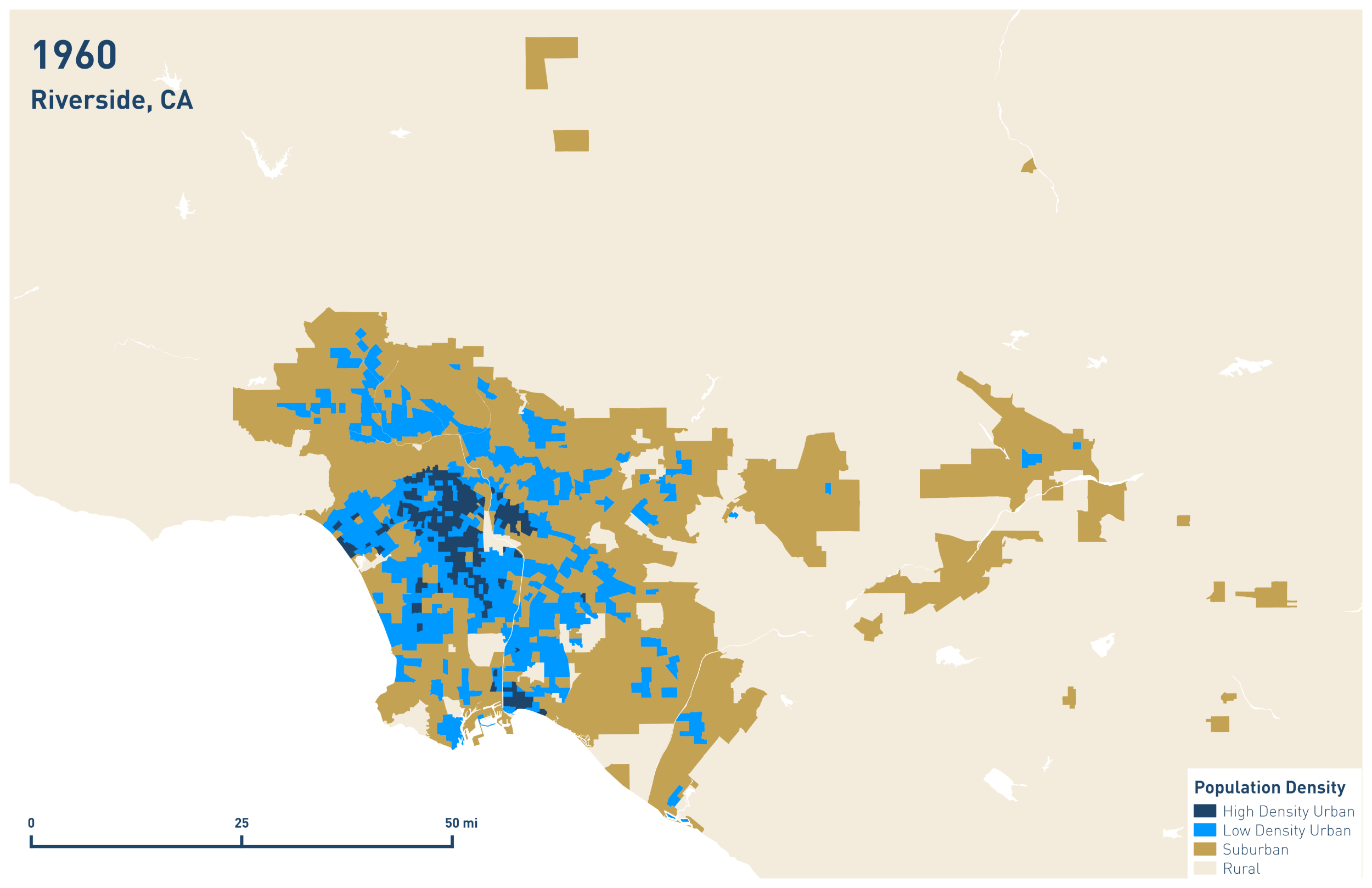
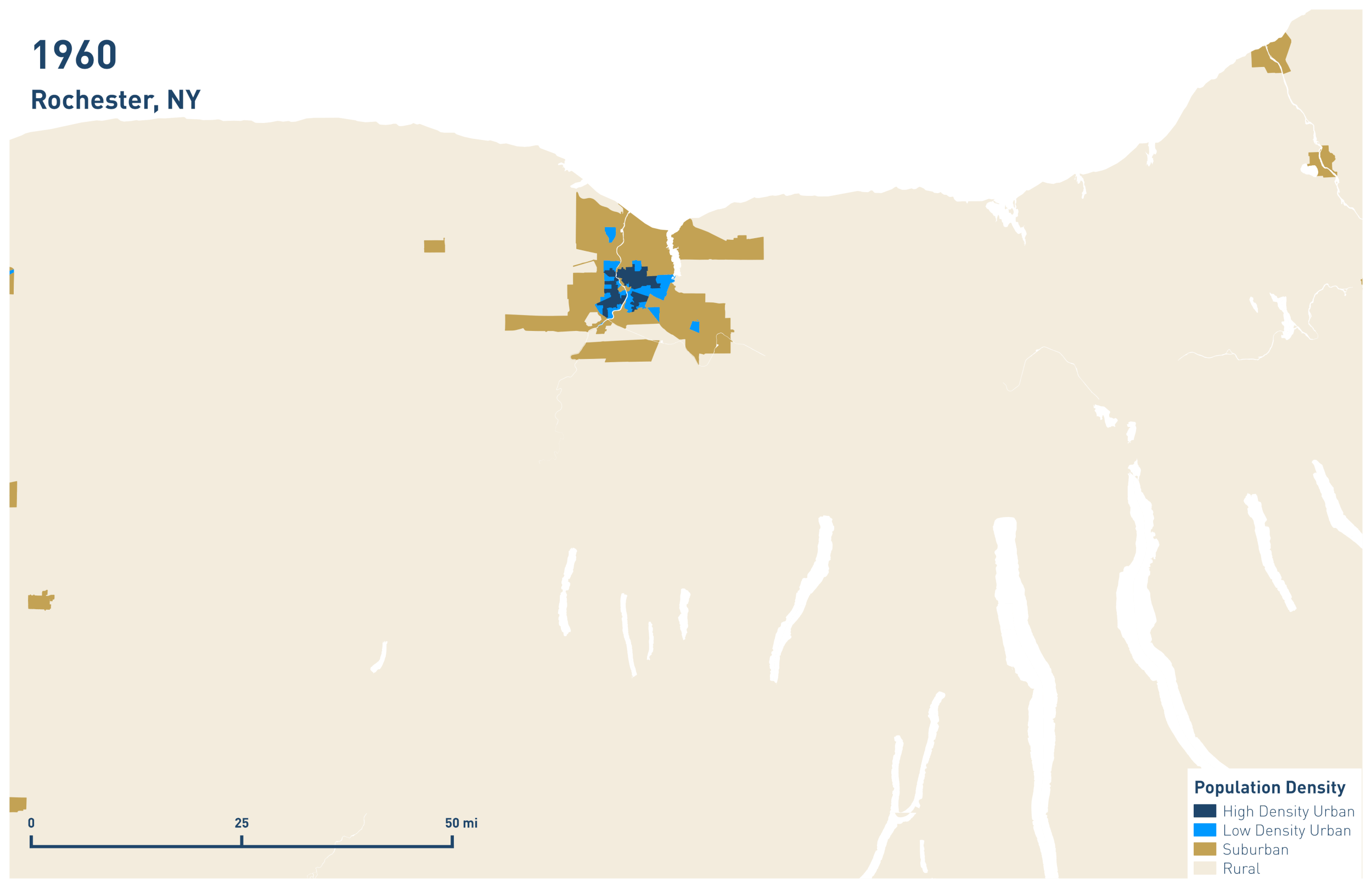
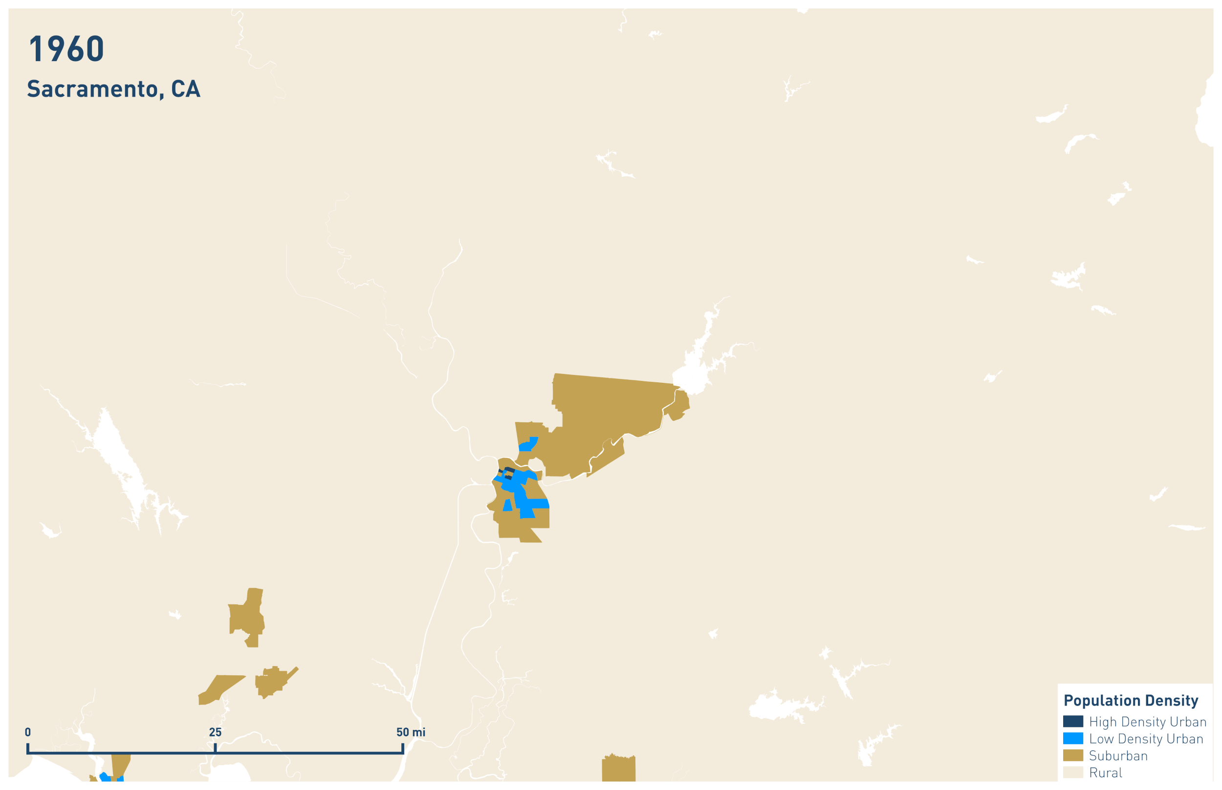
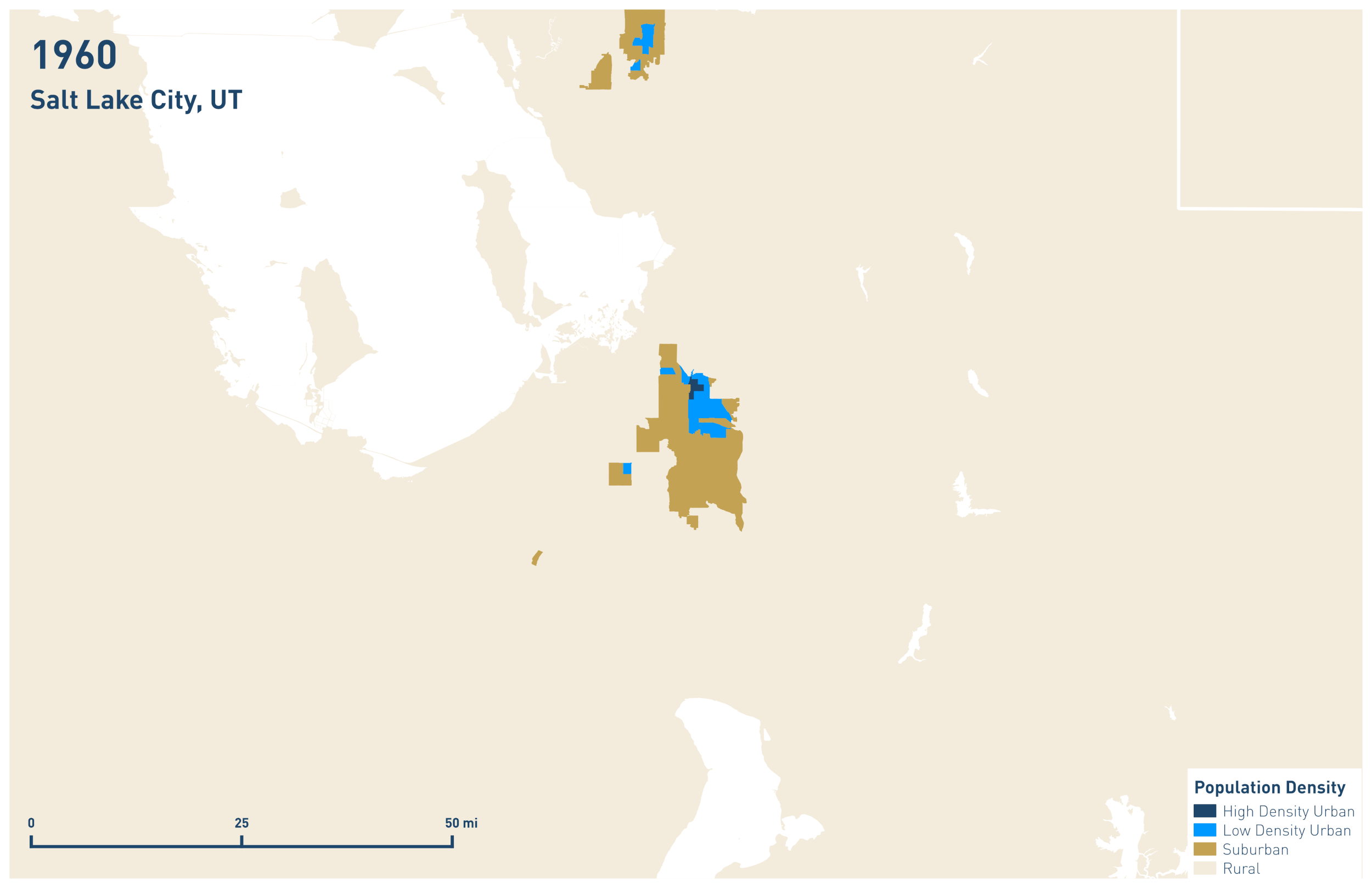
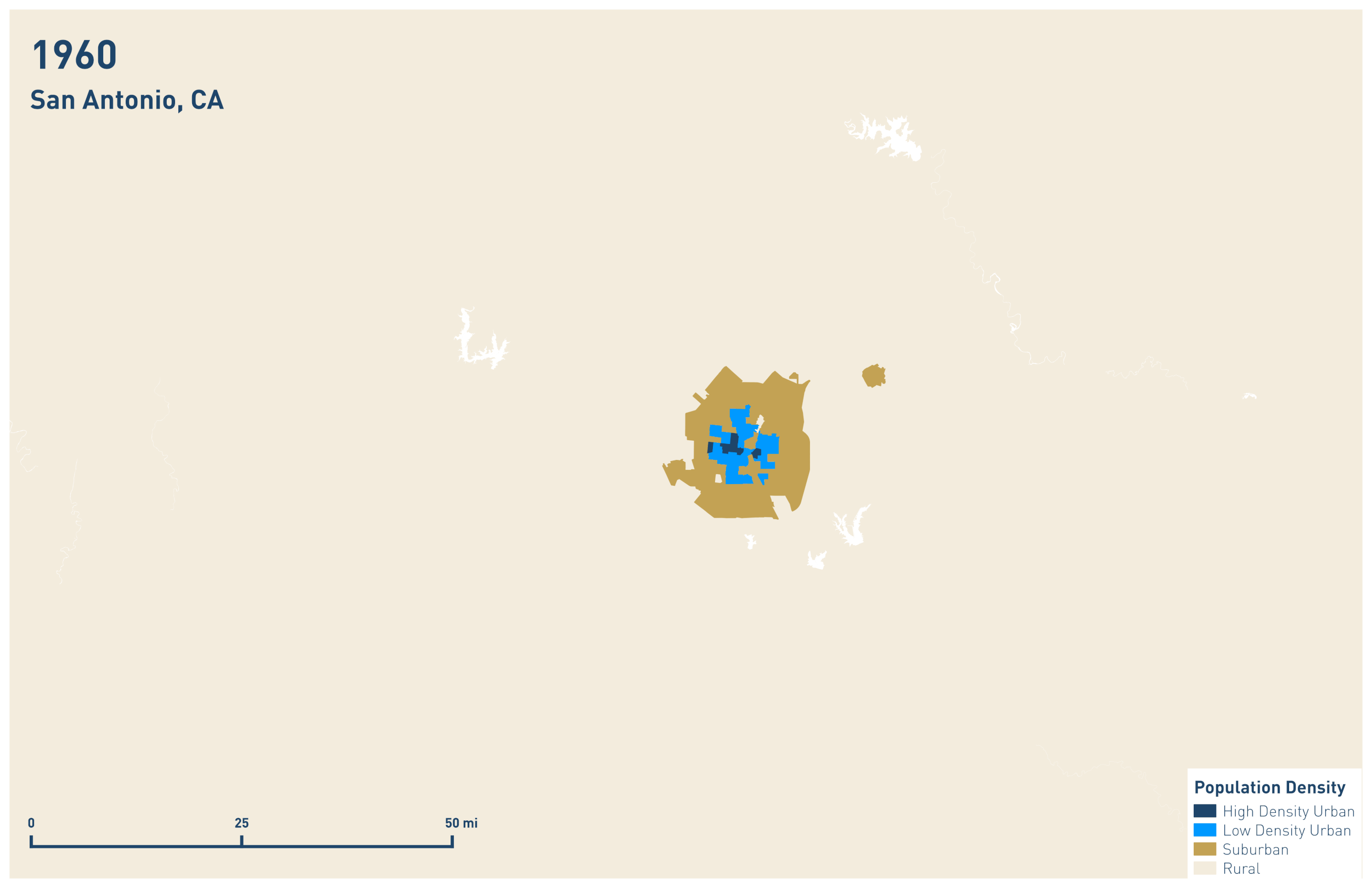
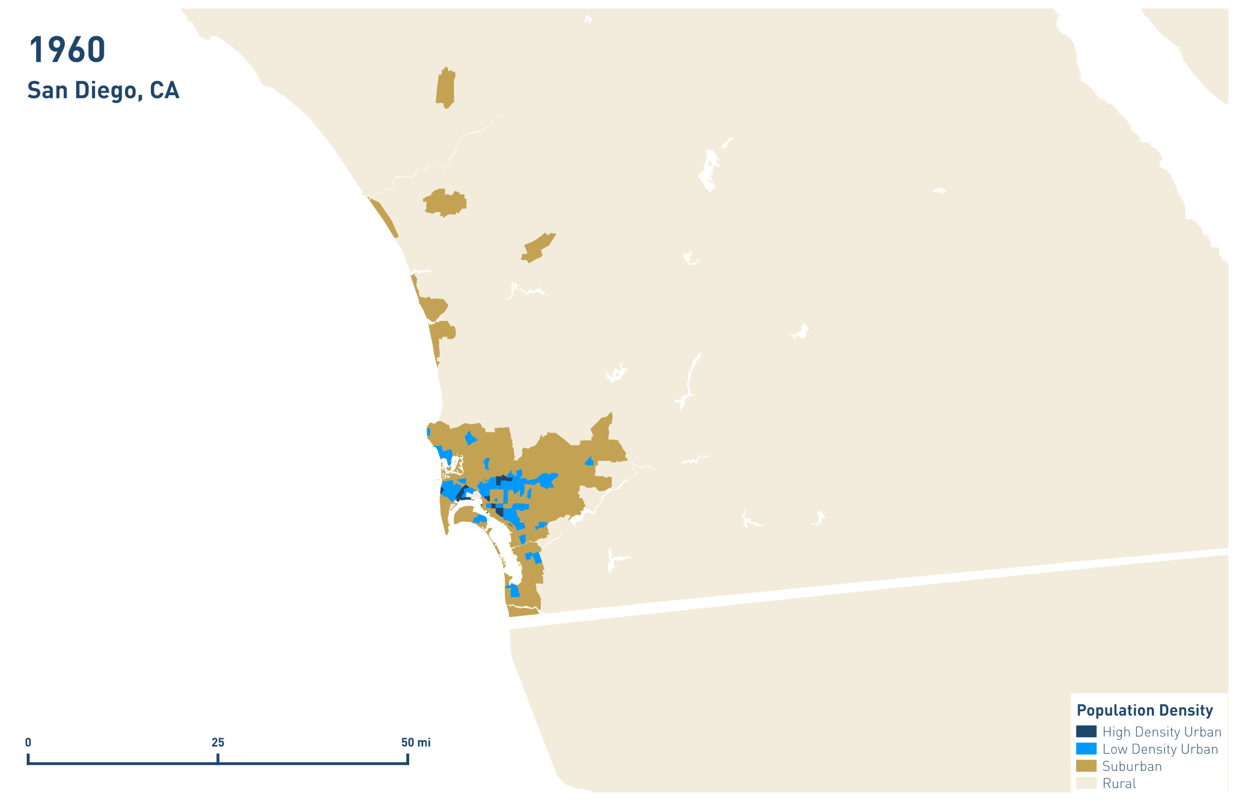
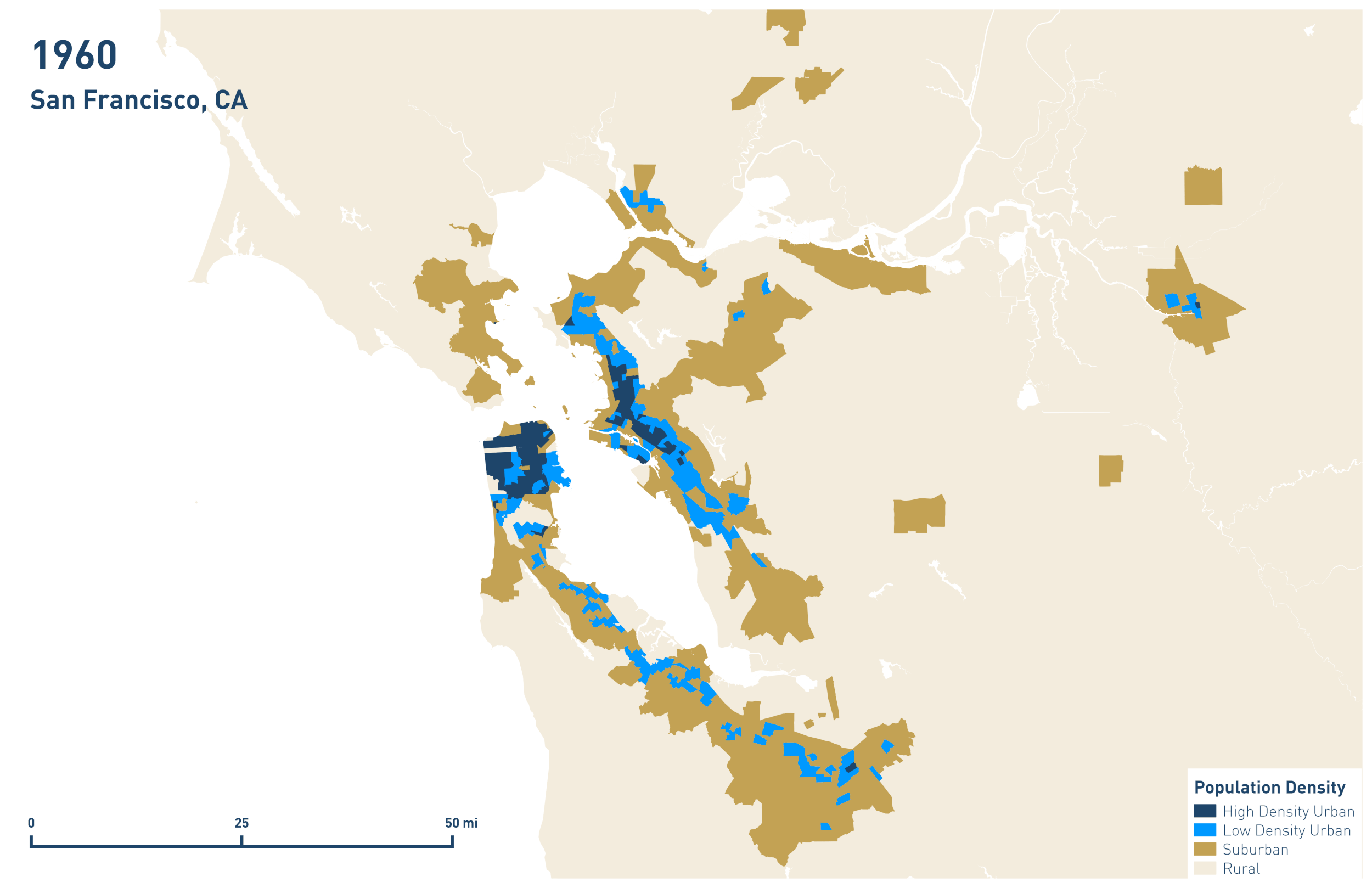
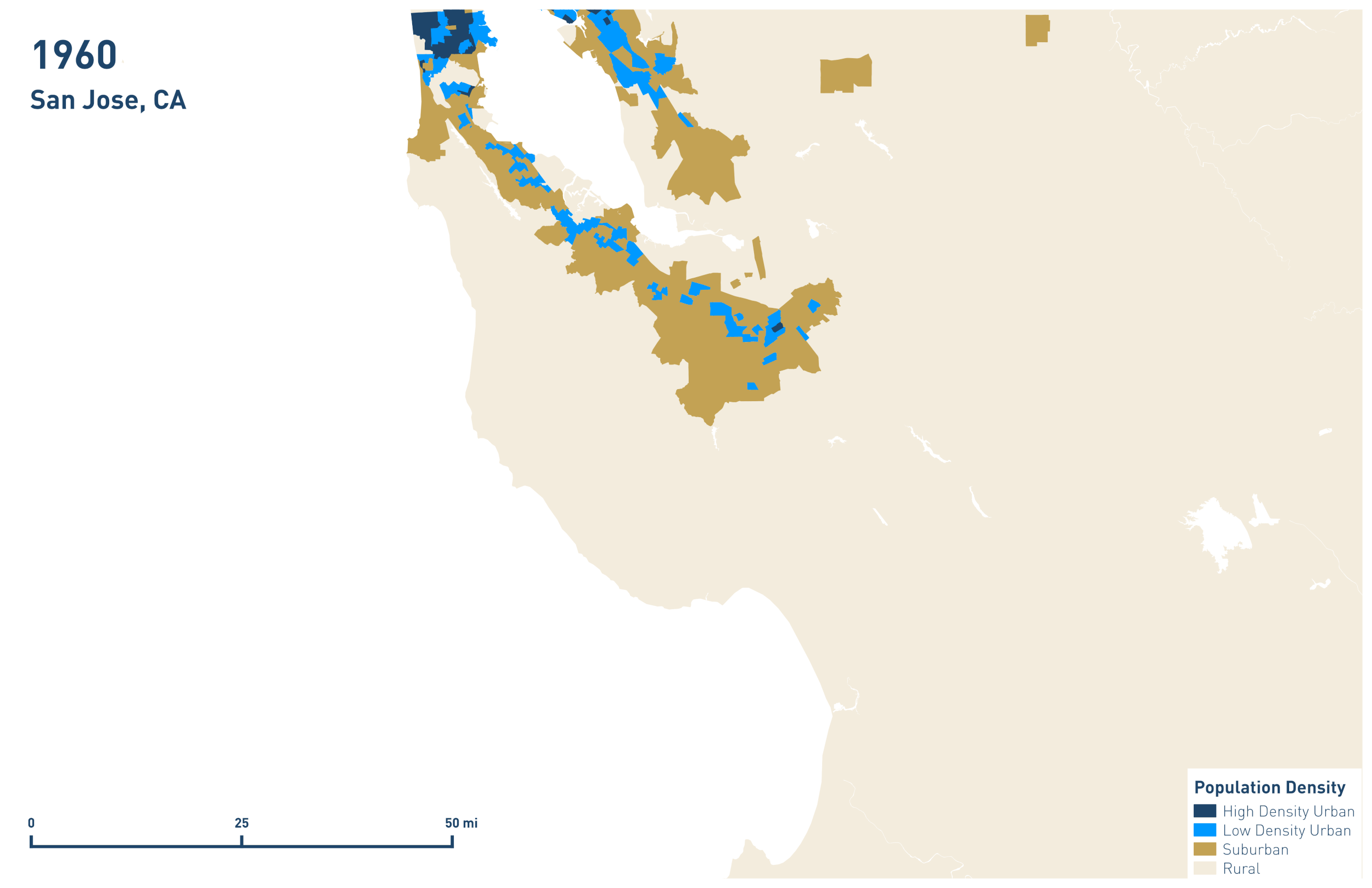
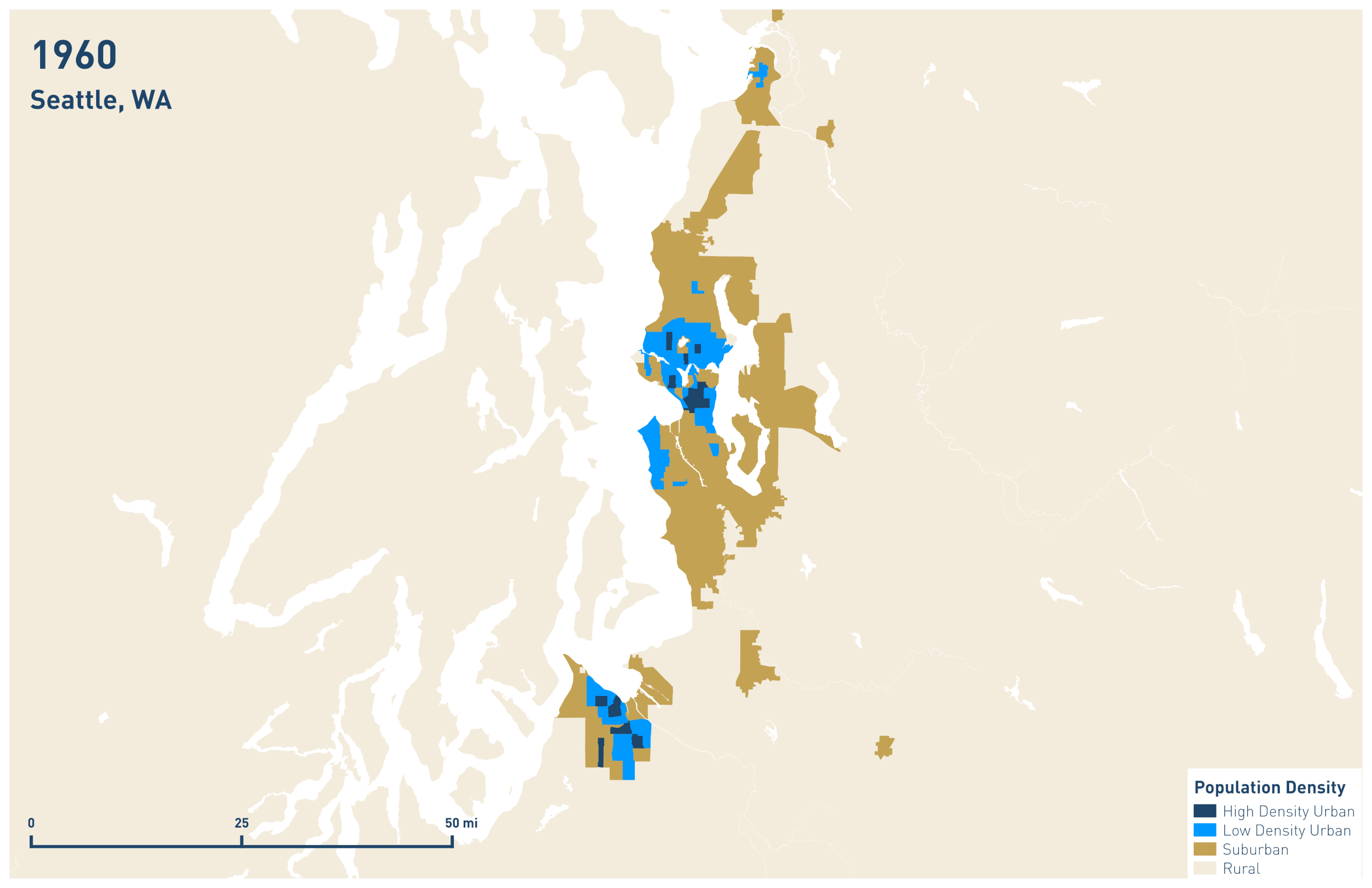
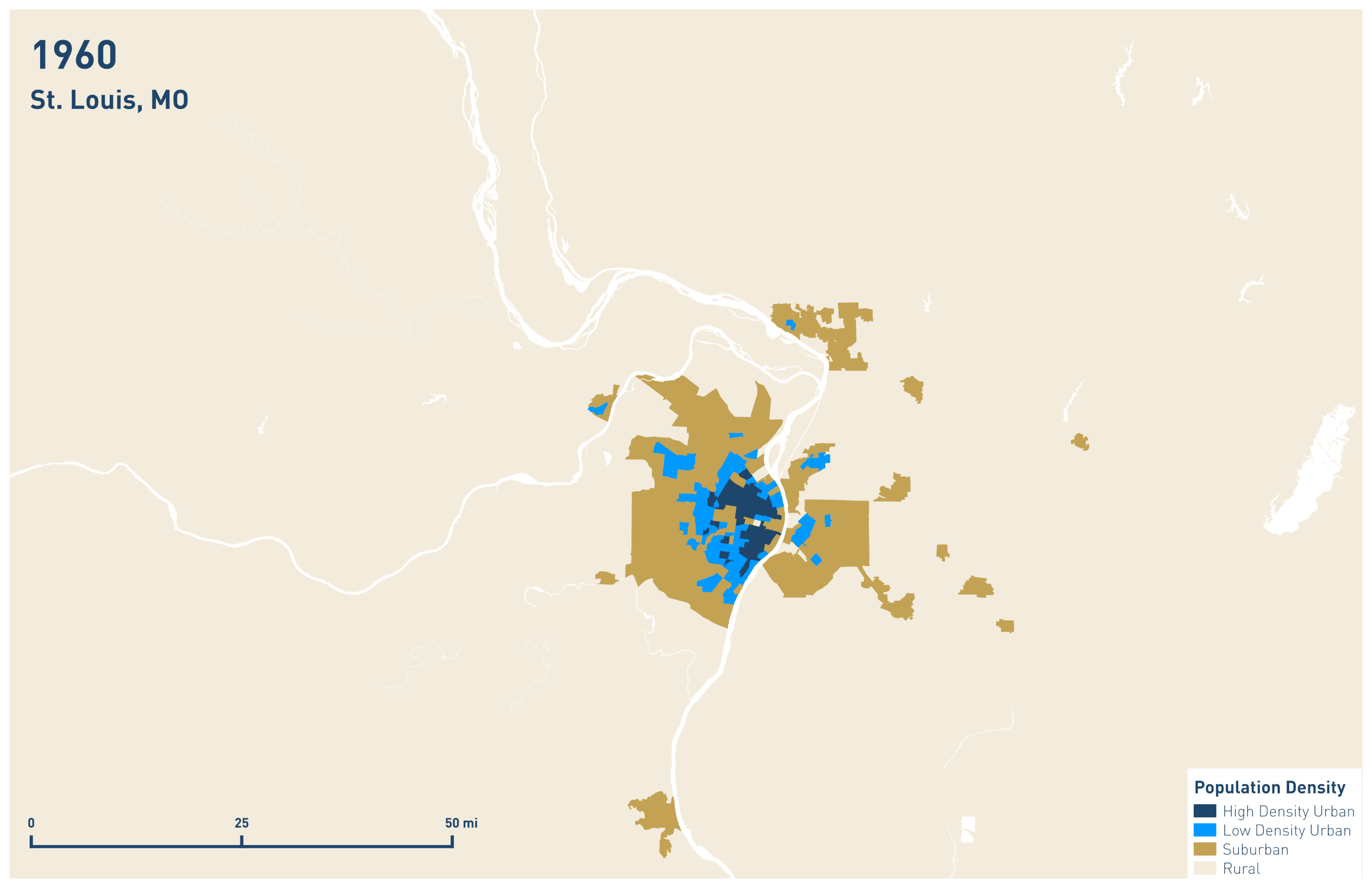
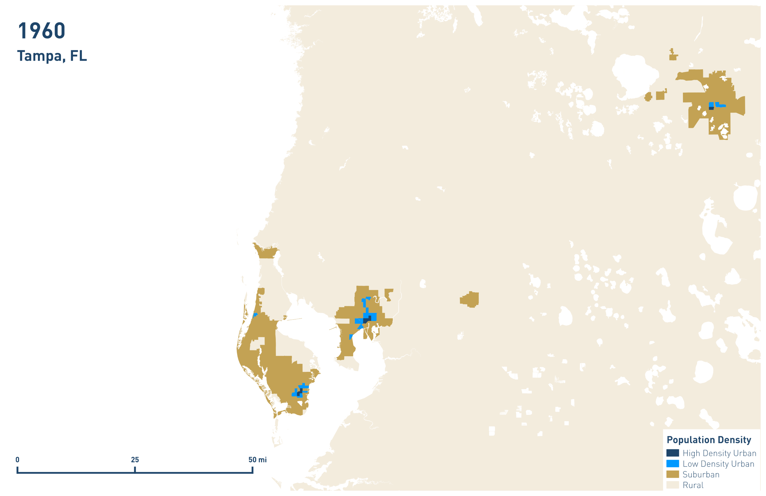
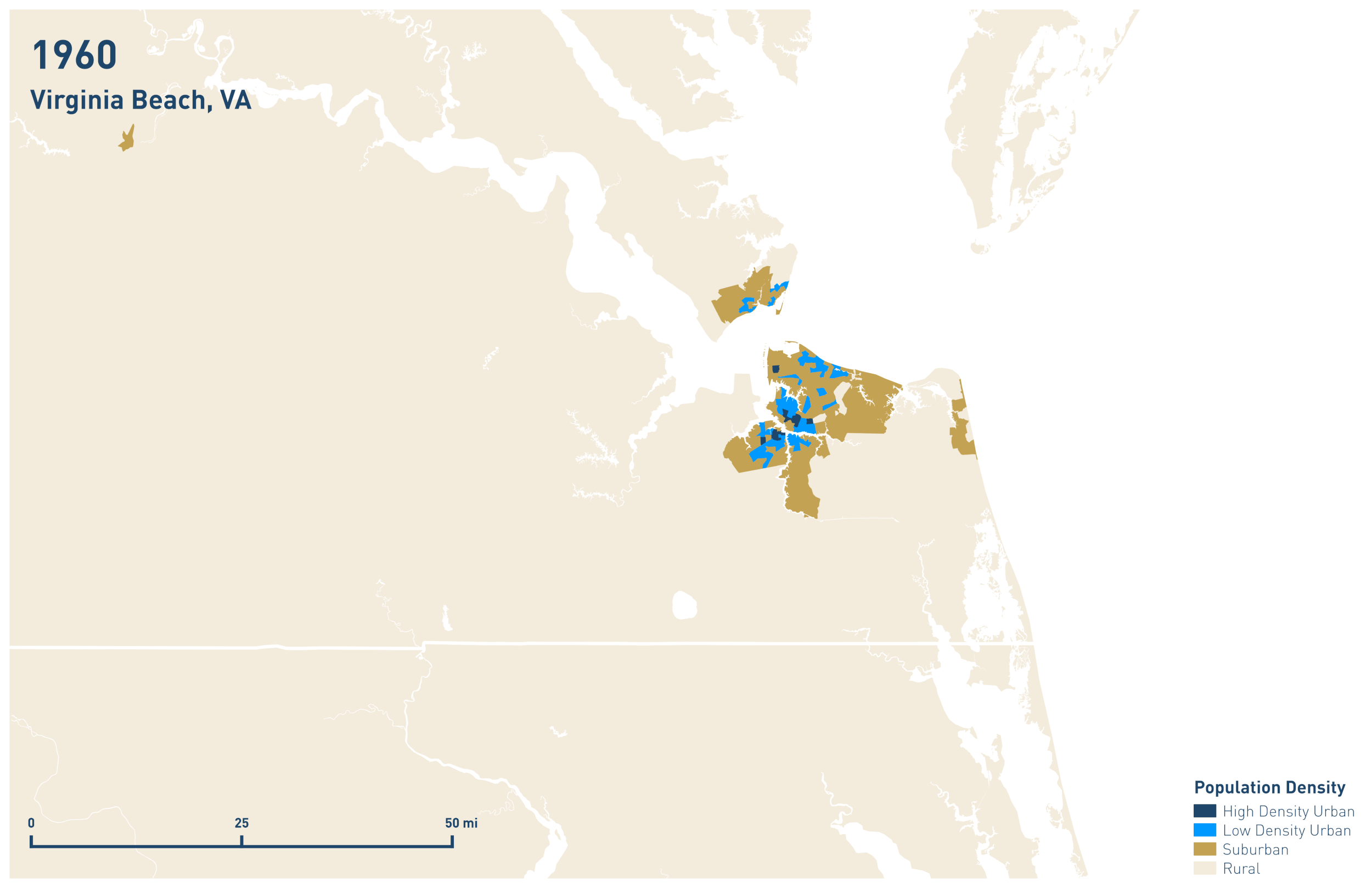
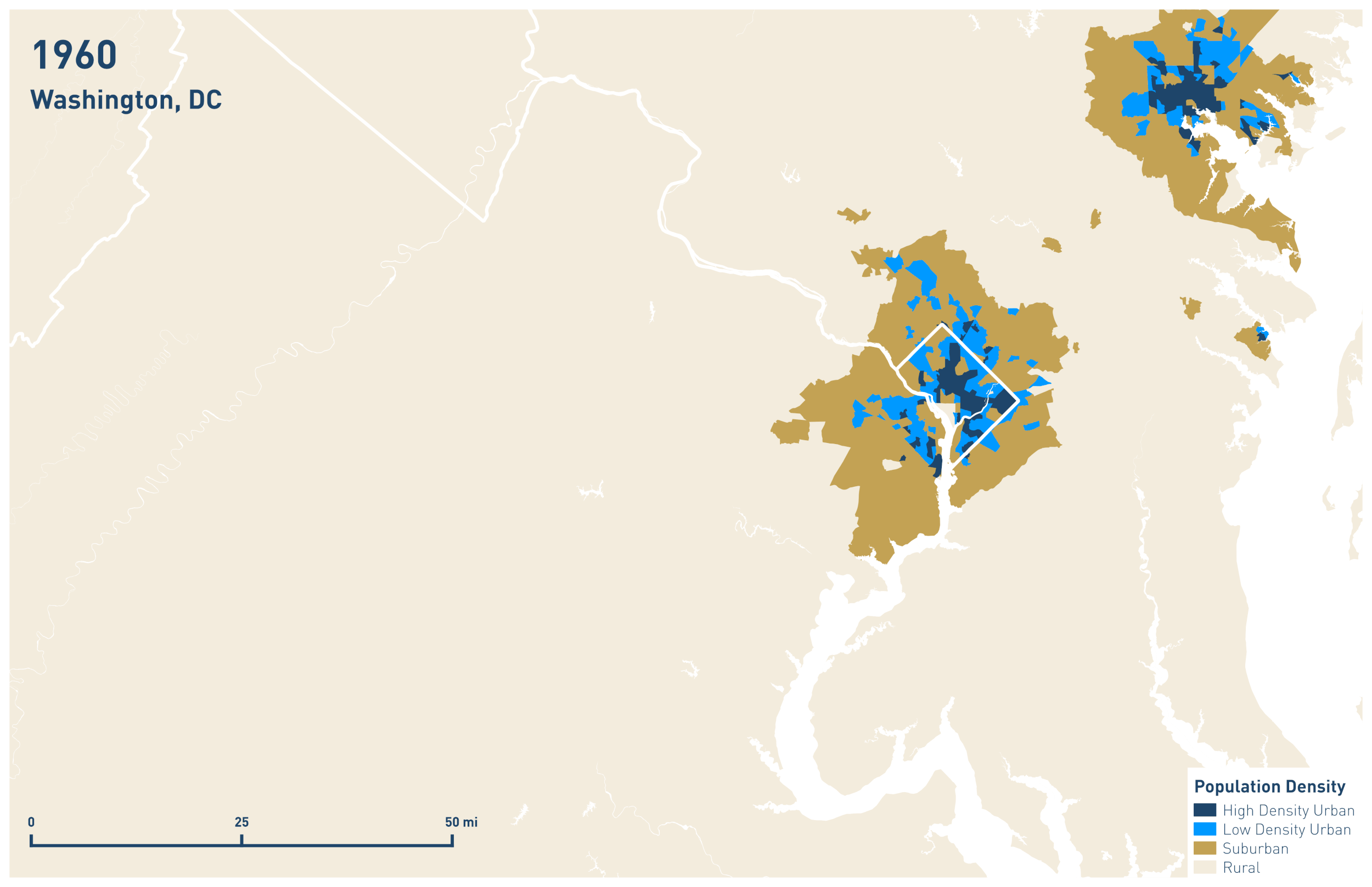
Goodbye Neighbor: A Historical Portrait of Sprawl in 51 US Cities
The average American of 1970 lived in a neighborhood over 30% more dense than the average American of 2013. What has been hailed as a process of 'urbanization' is actually the phenomena of suburbanization; we are increasingly distant from our neighbors. The following collection of gifs illustrates this historical phenomena in the nation's 51 largest metros from 1960 to 2013. Among them we see small towns become big cities (Las Vegas), large dense cities diffuse and evaporate (Detroit), and the onward march of suburban sprawl across the country.

Where Did All The Purple Go?
After the 2016 presidential election, a good deal of conversation was dedicated to American's increasing political segregation. Despite the focus, I couldn't find a map that compared 2012 and 2016 election results using the same colors and brackets. The number of Americans living in "purple" counties (with vote margins of less than 10% in either direction) shrank over 15% between 2012 and 2016, from 79 million people to 67 million people. The number of "purple" counties shrank from 557 to 326. I created this map in QGIS using data from townhall.com and the National Atlas of the United States.